Street Name Signs
The easier it is to identify the name of the street when driving the speed limit, the more time motorist will have to plan and safely execute a maneuver and return their attention to the road.
The shapes (footprint) created by an effectively designed mixed case typeface creates word patterns that aid recognition and the layout of the legend on the panel also contributes to readability.
Typeface is everything. Clearview in mixed case was designed to be viewed at long distance. Legibility studies by the Larson Transportation Institute, found that a mixed case street name sign using Clearview 2-W or Clearview 3-W outperform same sized FHWA standard alphabets e.g., FHWA Series C and Series D, by well over 20 percent respectively in both day and night viewing (research study 3 in this web site).
Sign panel layout is very important. Mixed case legend base-line on which the legend is placed (see grids below) to accommodate the descending letters (g, j, p, q and y), and to balance the mixed case legend even without a descending letter on display, places the lower case across the mid-section of the panel for all street name layouts.
Two options for layout of conventional street name signs. In both cases, optimizing the background area is more effective than adding a border within the same layout. If borders are added, the overall panel area should be enlarged as shown.
Note that upgrades to mixed case may require a custom blade size as commercial sign blades are generally available in only three sizes (6″, 6.75″, and 9″) that were designed to accommodate all upper-case legends. Option 1 in 6.75” (below), only is sized for mixed case in the letter sizes specified in the MUTCD. We recommend blade size(s) that fit the designs (see grids below). Cities commonly use an extruded aluminum blade for strength; this option can be consistent, effective and cost efficient, (section drawings for recommended sizes are attached for reference).
Two options are shown: These proportions would be transferable to 4”, 6″, 8”, and 12” capital letter heights.
Option 1) Legend shown is Clearview HWY® 2-W (6 inch) with default spacing provided in the Clearview font software
This example is the minimum blade size that accommodates the ascending and descending letters of a mixed case street name with a figure to field ratio of 1.66:1, or in the case of a 6” initial capital letter, the blank is 10”. This is wide enough to leave a small space from the top of ascending letters and bottom of the descending letters with background showing top and bottom.
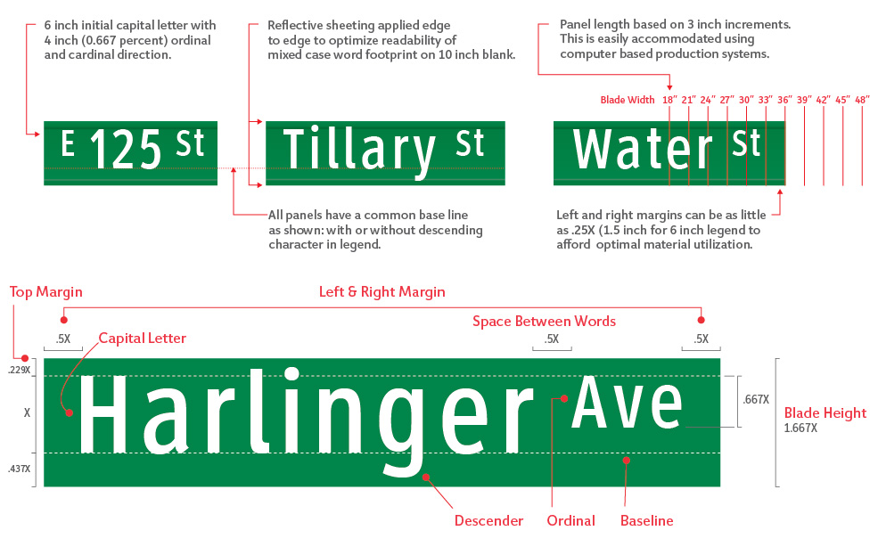

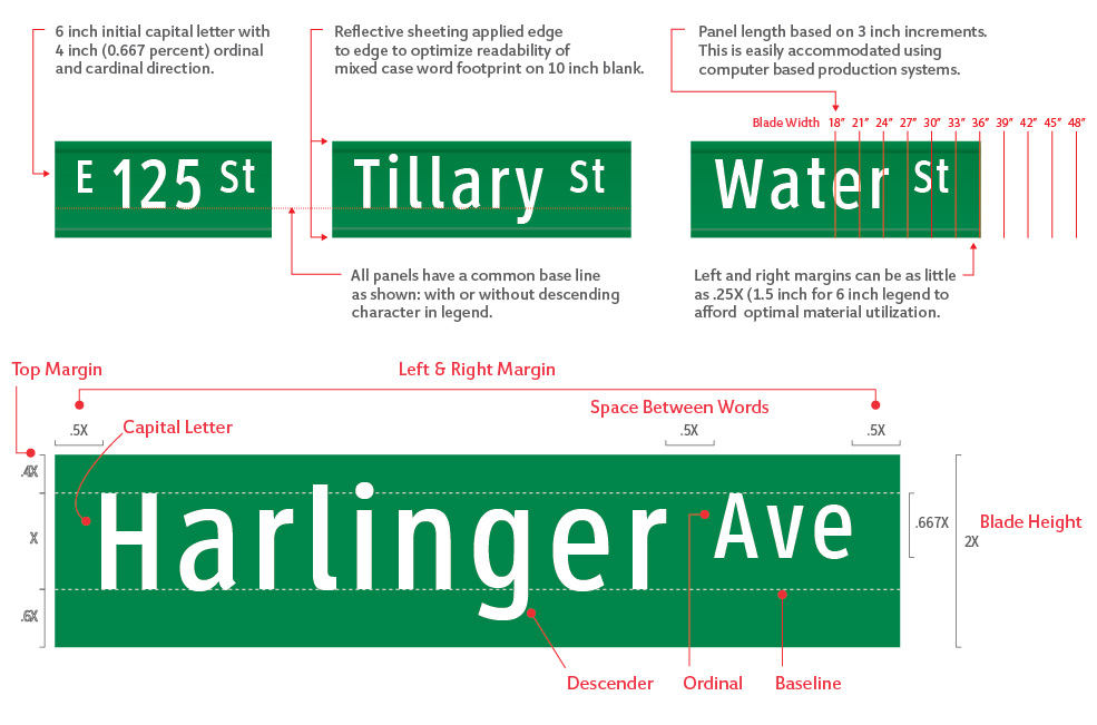
Option 2) Legend shown is Clearview HWY® 2-W (6 inch) with default spacing provided in the Clearview font software
This example provides more background space around the word and increased target value for the panel with a figure to field ratio of 1:2, or in the case of a 6” initial capital letter the blank is 12”. This larger background enhances the readability of the legend within the panel.

The following chart provides legend sizes, as specified in section 2.D-43 of the MUTCD (2009), with posted speed limits and width of road determining specified street name sign size.

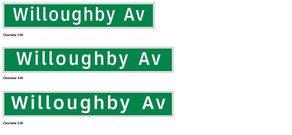
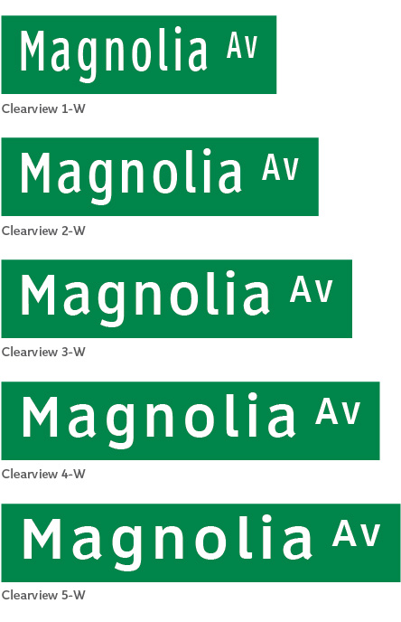
Comparison of typeface weights: ClearviewHWY 1-W, 2-W, 3-W, 4-W and 5-W
The chart below illustrates all five weights of Clearview with recommended inter-letter space. Legibility will be greater as the letter width is wider and the stroke-width is heavier. A simple layout mock-up printed in color on a large format printer can be utilized for field review. (Full size samples for comparative mock-up are provided for download on this page.)
Mock up layouts to allow on site comparison of similar versions of type, panel and format
The attached ZIP file contains full size examples of the streetname files shown in this section. This includes all legend sizes in each of 5 weights of Clearview and in the two formats (1:1.667 and 1:2) described based on capital letter height to overall panel height.
Select the size, format and font weights to be compared. Print on a wide format color printer and affix to a cardboard sheet cut to the same outside dimensions. Suggest viewing at 40 feet to the inch based on the initial capital letter height (example: 4 inch capital letter height viewed from roughly 160 feet, and a name with 6 inch capital letter height is viewed from 240 feet). This is well beyond MUTCD standards that are based on 30 feet to the inch, but allows for a realistic test of performance.
Included is a sign layout with 5” legend. This is not specified in the MUTCD but may be a helpful reference given that using 6” legend standards date back to panels with all uppercase legends and are often found to be oversized for many conditions. This specification does not take into consideration the longer legibility afforded by Cleaview typefaces.
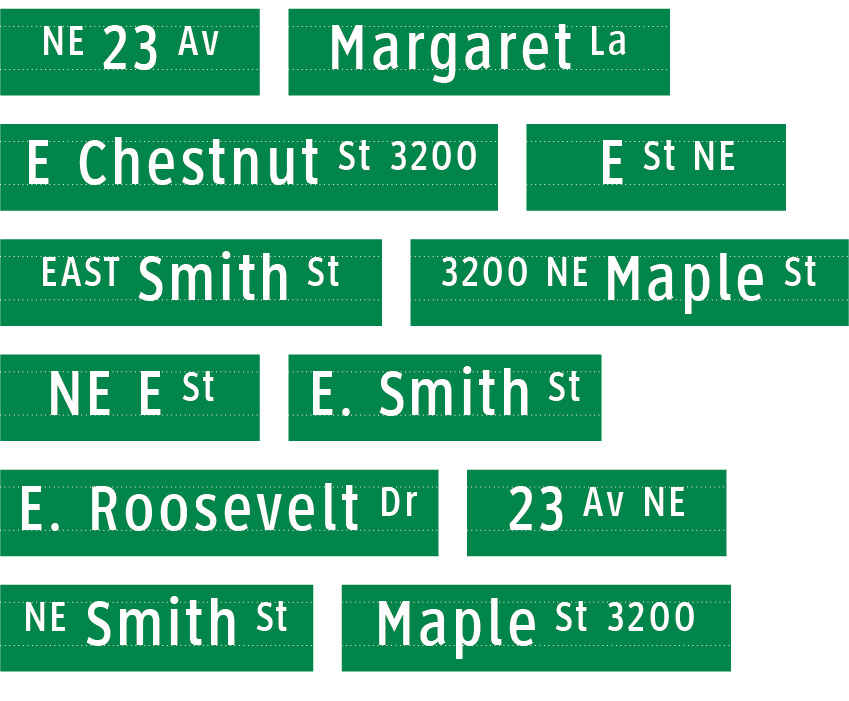
Ordinals and related directional identifiers
Street identification varies significantly from city to city. A variety of applications are shown. This format allows cardinal direction as well as block numbers to be displayed at 0.667x (67% of primary capital letter height) with ordinal aligning to the top margin on the layout grid. The smaller size helps controls the required size of the panel, while keeping the ordinal large enough to read effectively. As shown, a cardinal direction may be the same size as the primary legend in accordance with local convention. The graphic relationships should be consistent.
Comparison of Clearview 2-W to FHWA Series C with common capital letter height.
The MUTCD (per MUTCD, 2D.43) specifies that an ordinal be a minimum of 0.5x the size of the primary legend capital letter height and placed on the baseline of the street name. An example of this option is shown; when viewed at a distance, t this smaller size is not as effective.

Street Name Sign Layout
The width of the street name sign blade is most economically sized to the width of the legend in standard widths. The length of a sign blade is based on: the length of the street name, the ordinal and the space left and right as well as between the ordinal and the street name.
To determine lengths of layouts, the names of all streets to be signed are listed in a flush left format with appropriately sized ordinal using the selected typeface. This should proportionally scaled with top and bottom edge of panel identified (illustrated as grey mask).
A vector-based software (e.g. Adobe Illustrator) is utilized to lay out panels and determine the length for each sign. This list becomes the layout and the production artwork for sign production (convert to outline). What you see is what you get as optimized letter space is included in the ClearviewHWY® font software. Layouts can become a permanent record for replacements as needed.
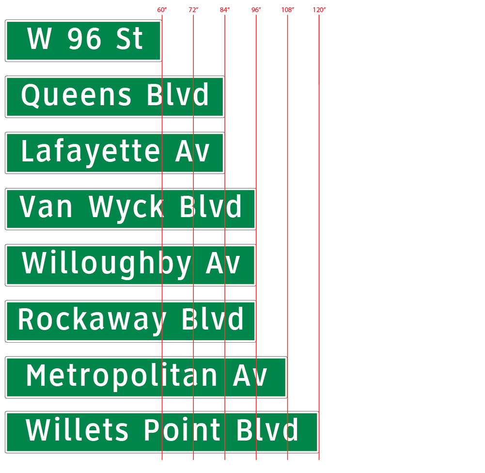
Once listed, a layer of precisely spaced vertical lines is placed on the layout to show length increments on sign panels. The increment will vary depending on size of sign.
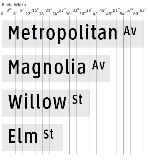
Example of a scaled panel layout to determine appropriate length of each panel. Vertical rules are on a separate layer of the graphic file. Each street name panel is optimized with minimal waste and results in a tailored looking installation. These layout files can be nested as a complete pre-spaced word for cutting if applied, assembled end to end with proper left and right spacing if produced on a Matan, or stacked and nested with common cut line between applied blades if produced on an ink jet printer (e.g., Durst, Mimaki), or prepared using computer cut overlay film.
Option 3) Legend shown is Clearview HWY® 3-W (8 inch) with default spacing provided in the Clearview font software
This hybrid example builds on Option 2 with 1:2 of capital letter to overall blank width, but includes a white surrounding border (at .833” within the overall panel) using an 8” capital letter height. This oversized sign is typically mounted on a signal mast arm to identify cross streets for motorists on both suburban and urban arterials. For most applications the 8” ClearviewHwy 3-W is adequate. Using the attached chart the legend and panel can be proportionally larger if viewing requirements require. Alternate use of ClearviewHwy 4-W or 5W provides slightly longer viewing distances as afforded by the heavier stroke width. In this case the legend is centered on the blank.
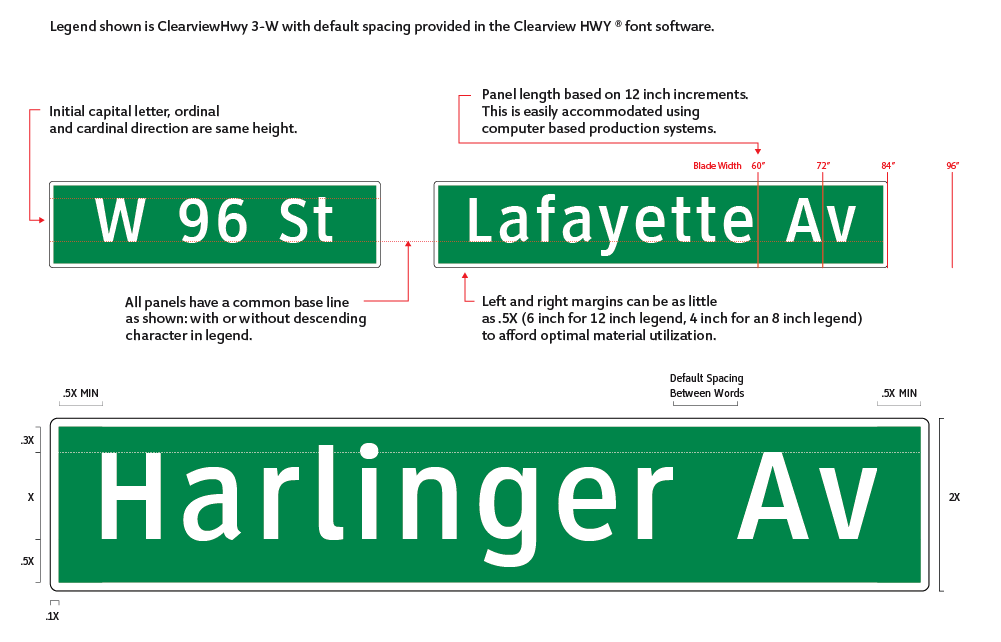

The diagram below shows, mast arm mounted panel using 8” legend with left and right margin between .5X and X.
This figure illustrates the difference between Clearview 3W, 4W and 5W.
