5) Glance recognition by the millisecond
Research evaluating legibility of Clearview font and FHWA Standard Alphabet measured the amount of time to identify a string of letters as a word or non-word, and at decreasing size.


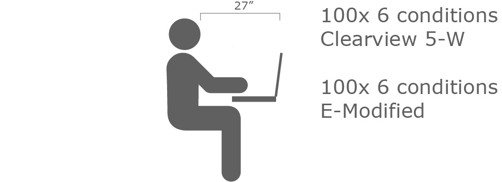
In the lab, the legibility test presented each participant with 6 conditions for each typeface/color condition on 100 trial screens. Participants were introduced to test procedure and given time to practice. Testing started when the subject expressed comfort with the task. Each trial was separated with a blank intermediate response screen. Viewing duration began at 800 ms and was adjusted for each subject based on speed and accuracy of prior response in a continuum of word or pseudo-word displays. The median exposure time was 100ms. The trial session was adapted based on the individual’s responses.
Many of the early Clearview research studies tested stimuli at full scale to replicate field viewing conditions at threshold. Other studies were conducted in laboratories using projections, and various high resolution testing devices that measure response controlled mechanisms.
A laboratory study can capture differences of glance recognition and glance reading timing and accuracy with precision. The MIT AgeLab study compared glance readability of FHWA Series E-Modified to Clearview 5-W to compare legibility of positive contrast word displays (white on black and white on green) and negative contrast (white on black) in measured exposures of both words and letter strings (pronounceable combination of letters but not words) in adjusting glance periods (milliseconds). In the sessions, older drivers and middle age drivers distinguished between 6 letter words and pronounceable non-word letter strings.
From this study of glance reading, legibility indices are defined and the difference between reading negative and positive contrast signs were measured. Clearview uniformly out-performed FHWA E-modified in all tests for all age groups.
In this study, the legibility thresholds of Highway Gothic (FHWA Series E-Modified) tested 12.3 percent higher than those of Clearview, indicating that Highway Gothic required more time to read accurately. The consistent superior performance of Clearview when displayed in the available color combinations, suggests that intrinsic design rather than extrinsic factors is critical to legibility.
Jonathan Dobres, Susan T. Chrysler, Benjamin Wolfe, Nadine Chahine, Bryan Reimer. MIT Reamer. Empirical Assessment of Legibility of Highway Gothic and Clearview Signage Fonts. MIT AGE Lab, Massachusetts Institute of Technology. Presented at TRB Annual Meeting (2016), Transportation Research Record No. 2624, 2017
