Conceptual Applications Design
With the development of an enhanced system of typefaces that provide longer viewing distances and enhanced readability using existing standard letter sizes, the design team began to identify more consistent methods to format guide and positive contrast signing.
While uniformity was a primary goal in the 1961 edition of the MUTCD, the absence of engineered performance standards for graphic elements, or a cohesive approach to design limited uniformity to sign color. Local interpretation of standards by city and state highway departments vary; regulatory and warning signs with different type sizes and formats contributes to roadway clutter while new signs for cyclists – sometimes not well differentiated from signage for motorists – add to visual overload.
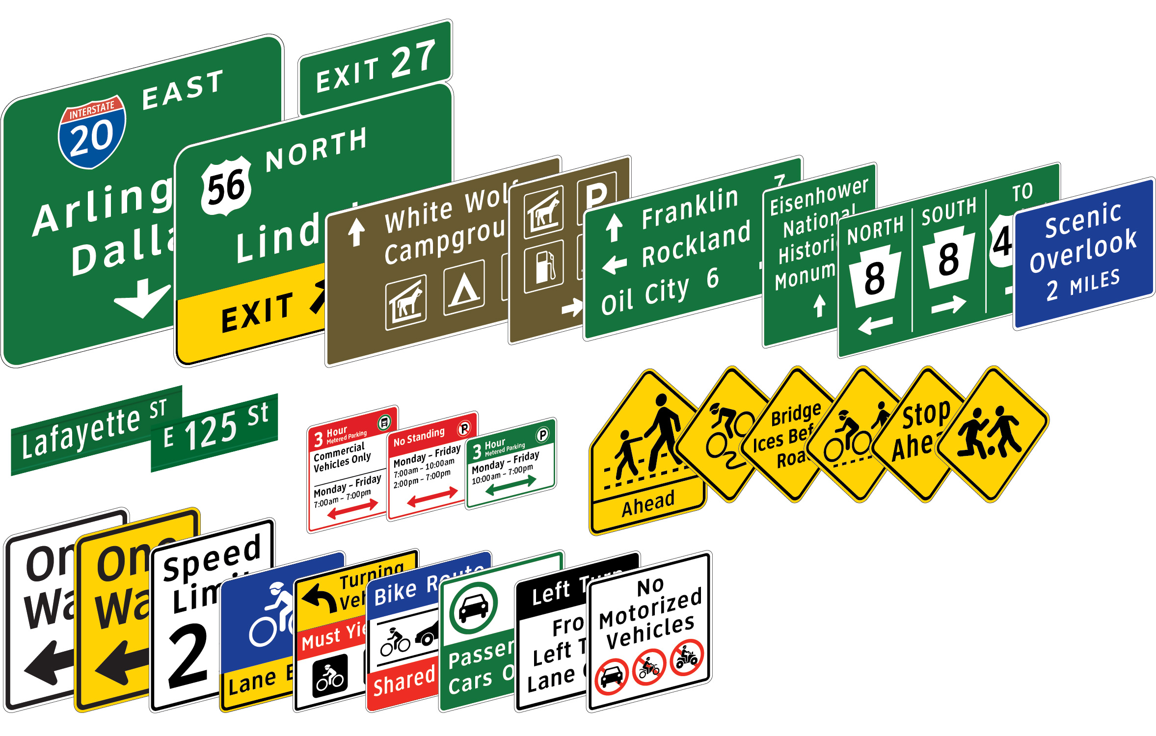
With standardized use of mixed case Clearview, we designed layouts to give order and to aid glance reading. The proportion-based grid system concept for conventional road guide signs and for freeway & expressway guide signs were peer reviewed and presented at the Transportation Research Board and published by TRB and ASCE.
This section presents an example from our project, Signing for Cycling. We prepared a conceptual plan to illustrate how an ordered system of signage enhances the effectiveness of individual signs and groups of signs. The project was initiated to solve inconsistencies and functional holes in the 1978 MUTCD Chapter 9 for cycling. New York City, Portland, OR and the twin cities of Minneapolis and Saint Paul MN were reference locations while city traffic engineers and cycling advocates nationwide reviewed our work. Integral to the design is an animate symbol for cyclist and use of mixed case. Signing for Cycling breaks with some 1961 MUTCD conventions but its functional attributes are based on signage work that has been studied. We hope this work will be scientifically reviewed.
The attached studies follow a logical design process based on functional requirements of guide and information signs. The designs were prepared to be compatible with the MUTCD with functional deviations by our team that are reviewed and explained.
The designs maintain uniform and consistent use of typefaces. The proportional systems used for layout are not approved by the FHWA but are an alternative that can simplify layout and make guide signing visually consistent. The formats apply to mixed case legends with descending letters.
Applications Design
