2) Legibility improvements for freeway signs
Clearview 5-W and Clearview 5-W-R both out-perform FHWA Series E-Modified in older driver study
The design team learned that small fractions of an inch added to a stroke width or to the space between letters are apparent at long distances (900 feet for an 18” letter). The space between letters is an essential factor in all text weights of Clearview so that word patterns are easily recognized viewed at threshold. Spacing is tailored to each weight based on tests and field review of large sized font designs. Spacing is critical for guide signs on freeways to facilitate readability at a glance from threshold. Too much letter-space will obscure the word pattern while too tightly spaced letters are not easily read at a glance and may overglow letter-to-letter when viewed at night. Type on signs viewed from a long distance requires more space.
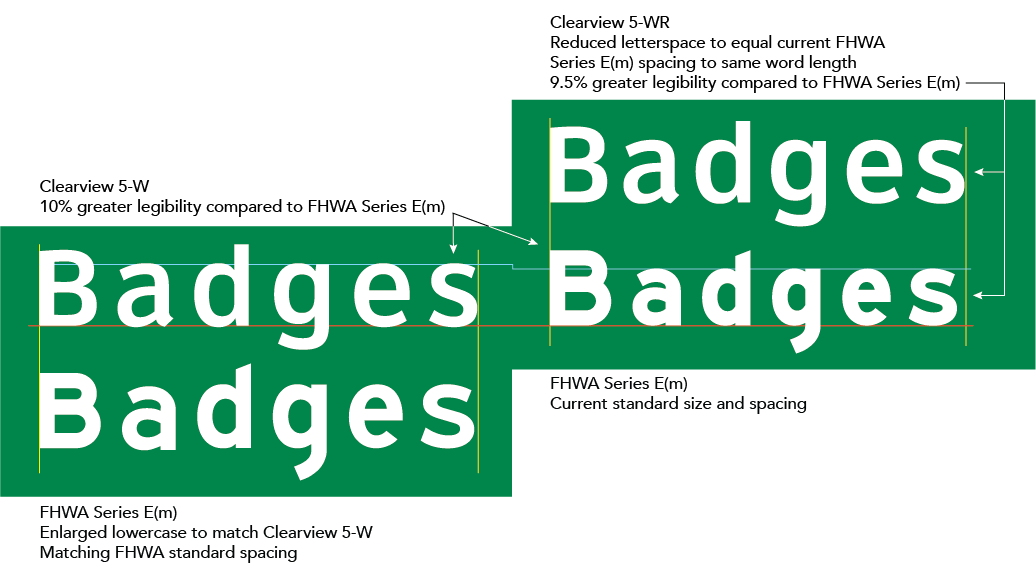
In designing the new font, designers considered the size of panels used for the FHWA standard. While the sizing of words in Clearview 5-W, the mixed case version used for freeway destination names, is generally similar to the size of the FHWA Series E-Modified, there are differences. Words in Clearview 5-W tend to be slightly longer than FHWA Series E-Modified depending on the width of the individual letters (For example, round letters take more space.). State DOTs using Clearview 5-W report that there is generally room on the left and right sides (balance between) of a panel for minor adjustment if replacing with the exact same size panel in upgrade projects.
Comparison of Positive Contrast Clearview 5-W and Clearview 5-WR to FHWA Series E-Modified (Mean for all participants).
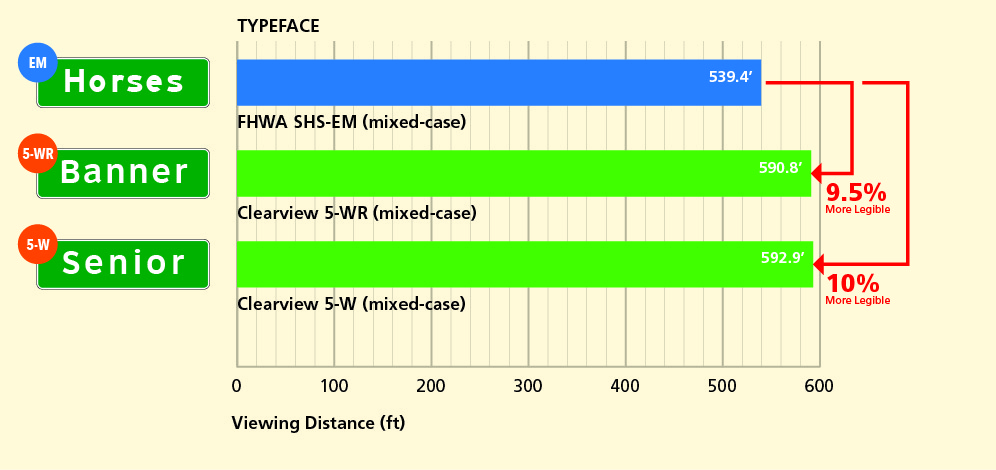
Accommodating this width increase results in improved overall legibility of10 percent based on this Texas A&M Transportation Institute (TTI) test track study of Clearview 5-W (final 2002 version of Clearview). That can be a second or more increase of reaction time.
If a sign panel is being upgraded to Clearview 5-W and the resulting layout is longer that the E-Modified legend being replaced, an alternative version of the font designated Clearview 5-W-R can be used. The “R” version, that is identical to Clearview 5-W but with a very small reduction in letter-space, was developed by the Clearview design team with a TTI research team and the Texas Department of Transportation. . The alternate spacing values built into the font software keeps word width in 5-W-R comparable to widths inFHWA Series E-Modified legend. The overall legibility improvement is 9.5 percent using Clearview 5-W-R (.5 percent less than optimal spacing). This version of Clearview still provides a significant improvement in legibility when compared to FHWA E-Modified and is used by many states.
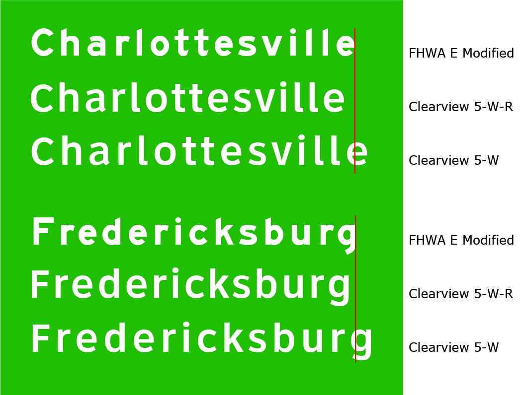
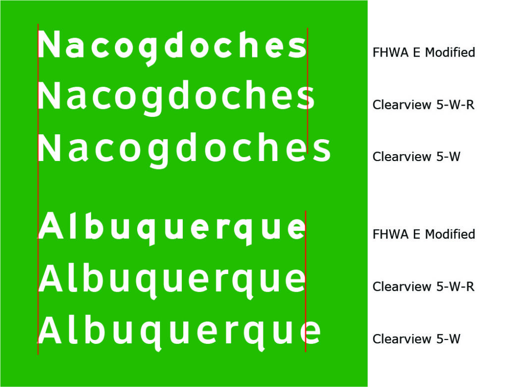
Comparison of Clearview 5-W and 5-W-R to FHWA Series E-Modified with Long Destination Names
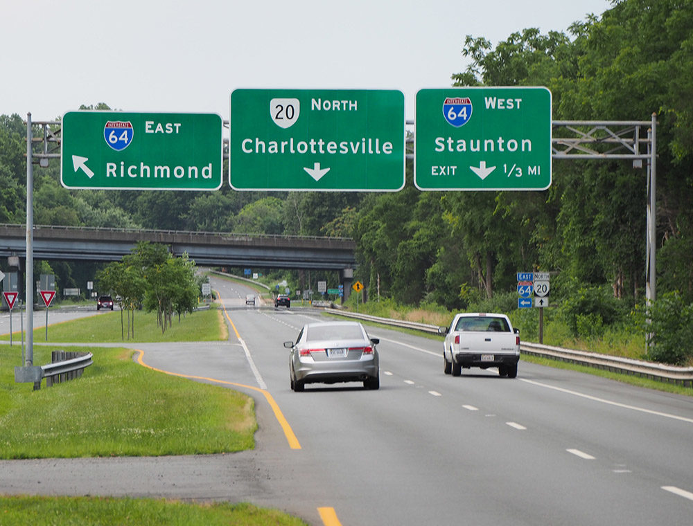
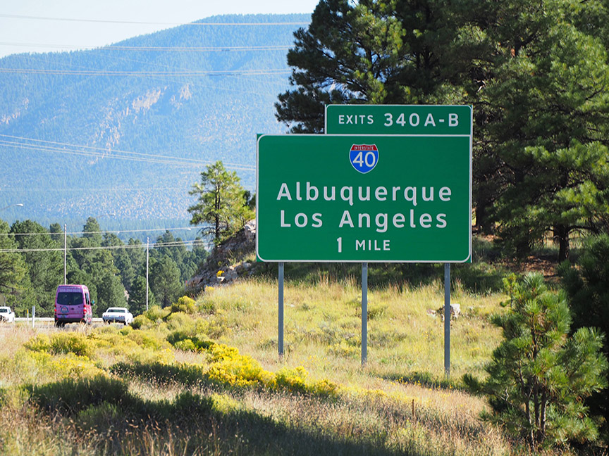
Photos of Clearview 5-W signs in Virginia and Arizona. The word diagrams show the differences between FHWA series E-Modified (top), Clearview 5-W-R (middle) and Clearview 5-W (bottom) of each three word displays.
Holick, A. and P. J. Carlson. Nighttime Sign Legibility as a Function of Various Combinations of Retroreflective Sheeting and Font, Report No. FHWA/TX-04/1796-4. Texas Transportation Institute, September 2003.
