The Older Driver
One fifth of the driving public is over 65 years of age; baby boomers live longer and continue to drive.
The physical changes experienced as a part of aging varies for individuals but include:
- reduced visual acuity,
- slower reaction times in response to changes in the driving environment, the task of glance reading and reacting to signs, and
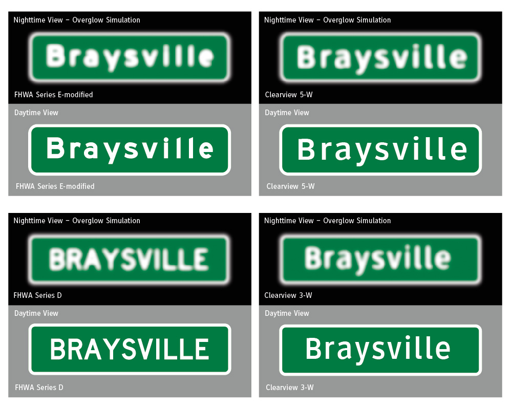
- increased sensitivity to contrast at night as dark shapes become darker. For example, headlight illumination creates disorienting glare while letters on high-brightness retroreflective sheeting can cause the older driver to experience overglow that distorts letter shape and impedes reading of legends.
Our project to improve road sign readability and legibility began with: observations of existing applications – documented in hundreds of photographs; comparative field observations of various typefaces; a study of MUTCD standards and the historical foundation of standards; interviews with traffic safety engineers, vision experts, sign material manufacturers and; a reading of technical literature describing the effects of aging on a driver’s vision – day and night. Human factor research was applied to new typeface designs as the project progressed.
1) Bigger Is Not Better: Typeface with Articulated Attributes
The physical effects of aging were well known in the mid 1980s. In the late 1980s, the FHWA sponsored studies to learn how the older driver could be accommodated with changes to road signing. As the attempted solutions were patches or adaptations based on existing FHWA typographic standards, they carried the limitation of the standards. For example: a major federal “older driver” study (Mace, et al., 1994) (1) recommended lettering on all guide signs be 20 percent taller – but 20 percent taller was 20 percent wider or 50 percent bigger overall and did not address over-glow experienced by drivers as retroreflective signs were illuminated by their headlights. Lane width limitations on sign size and added wind loading of larger structures discouraged action on this potentially multi-billion-dollar, bigger-is-better-solution. Furthermore, the focus was primarily tied to freeways yet, this study made no recommendation for guide signing on conventional roads although there are fifty-seven times more conventional road miles than freeway miles and guidance on roads is more frequent and complicated.

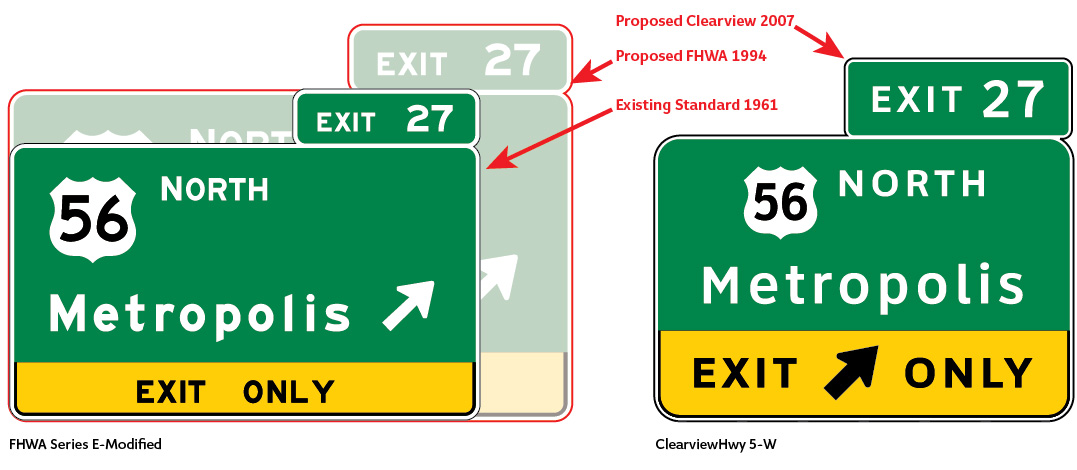
The original FHWA layout (1961) with footprint (red outline) of proposed 20 percent increase of FHWA Series E-Modified legend to aid the older driver (1994). The 20 percent would result in an overall panel size 50 percent larger as what goes up goes out proportionally.
Panels using Clearview within standard legend size would increase legibility and readability by 12.3 percent with same size panel using Clearview 5-W.
Clearview project team results: For guide signing on both freeways and conventional roads, the new typeface improved legibility and readability and addressed sign over-glow at night for older drivers with negligible increase in the size of freeway guide signs.
(1) Mace, D.M., Garvey, P.M., and Heckard, R.F. Relative visibility of increased legend size vs. brighter materials for traffic signs. Publication No. FHWA-RD-94-035. (1994).
2) Improving Freeway Sign Readability Day and Night
Reviews of existing research, comments from state highway engineers and the manufacturers of the modern high brightness retroreflective sign materials confirmed that existing signage lettering was prone to over-glow and fill; letterforms were not easily read when illuminated by vehicle headlamps. Mixed case FHWA-E-modified and all upper-case letters and words on conventional road guide signs halo or overglow as a bright shape with inconsistent definition.
Addressing this condition was integral to the design of the Clearview typeface.

Clearview project team results: Although Clearview 5-W has a stroke-width to height ratio similar to the FHWA Series E-Modified (1:5), the design of the typeface creates letterforms that that are easier to read at long distances. This eliminates hot spots and optimizes readability at threshold for both day and night.
3) All Upper-case Block Lettering or Mixed Case?
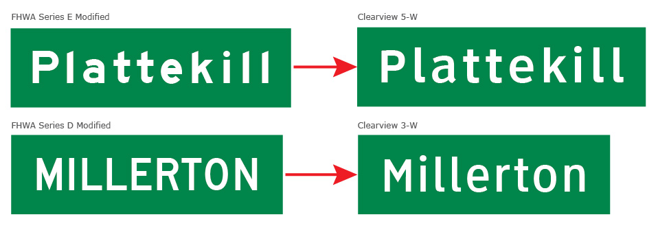
Although freeway signs used mixed case FHWA Series E-modified font for destination names on guide signs, mixed case was not used for conventional road or for regulatory and warning signs. Freeways represent a small fraction of road signing; we asked how mixed case type would perform in other applications. Reasoning suggested that word patterning created by mixed case should aid readability. While mixed case was used extensively in the UK and European road signage, there was little research about the effectiveness of mixed case compared to the same sized capital letters as the existing standard. We designed and refined a new mixed case alternative to all upper case FHWA Series D based on a structure created for Clearview 5-W.

Clearview project team results: In early studies based on an equalized footprint, daytime word recognition was improved by 12 percent. At night, the lower-case font out-performed Series D by 16 percent. As the designs were refined, performance values improved. The work highlighted legibility and recognition. The easier to read font and the more distinctive word shapes created with mixed case improves guide signing (including street name signs) and road signs viewed by the motorist searching for the desired decision point.
Improving legibility and readability extends reaction time that can save lives.
In trials, Clearview 5-W resulted in a significant improvement in sign legibility and readability on freeways with minimal, if any, increase in the size of sign panels. That readability (identified in studies: 2, 4 and 5 attached as 10 to 12.3 percent) is a second or more of added distance (time) to brake or maneuver that can avert a crash or reduce the severity of an accident.
A new mixed case, Clearview 3-W was designed for use on conventional road guide signs. This solution maintained the legend sizes specified in the MUTCD with a mixed case typeface of similar mathematical proportions to Clearview 5-W but with a thinner stroke-width and slightly compressed letters. The solution afforded a significant improvement in readability compared to all uppercase standards. Compared to FHWA mixed case Series D, the Clearview legend was 29 percent more legible in daytime and 22 percent more legible at night with greatest benefit for older drivers.
