At a time when roadways were lightly traveled, typefaces for guide and regulatory signs were based on application methods and existing graphic products and technology. As the driving populations grew, roads improved; modern construction accommodated higher speed. Under these new conditions, sign design limited to color, size and shape evolved.
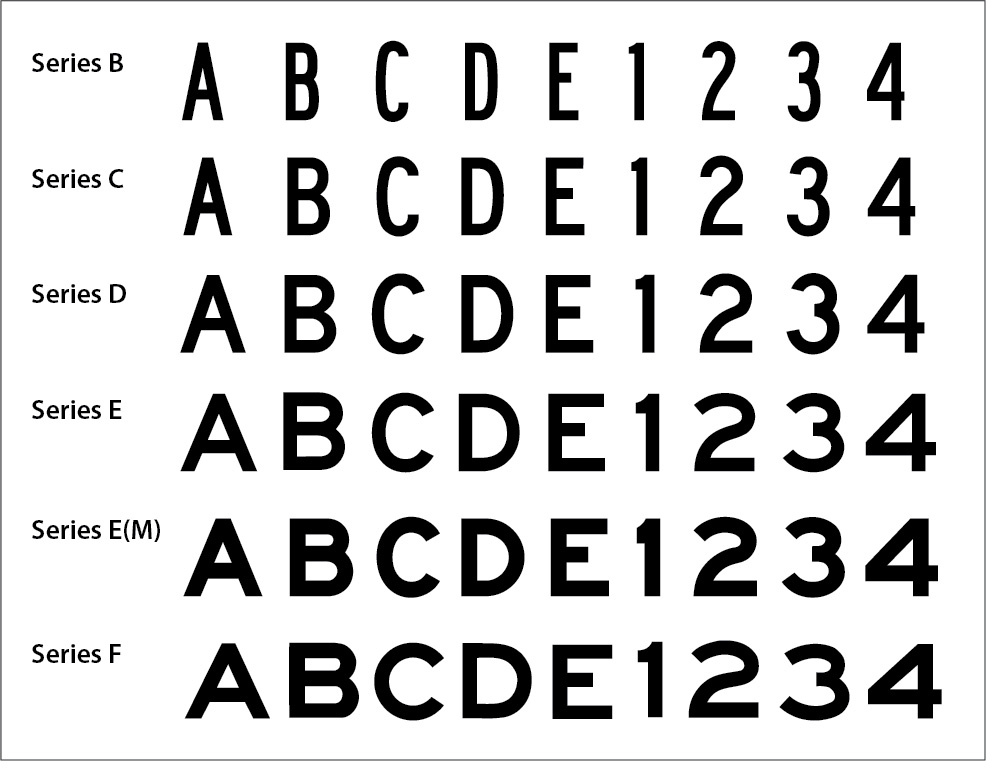
The first AASHO (later AASHTO) highway sign manual (1927) standardized on six all capital letter typefaces for U.S. road signs.
Hand painted highway guide signs in Oregon (1920).
An early demonstration of new mixed case guide signs designed by Ted Forbes (1948), a highway engineer with the California Department of Transportation.
The expanded FHWA Series Standard Alphabets with lower case characters introduced into the MUTCD (2003).
In 1927 the American Association of State Highway Officials (now AASHTO) published their first highway manual. Highway officials adopted upper case in block letters for guide and regulatory signs. The fonts originated from hand-painted brush lettering on guide signs, or hand-cut masks for screen printing regulatory signs in multiples. The fonts were standardized in six different weights of block lettering from a wide sized lettering to a very condensed version of the series. The design assumed that the wider the letter and thicker stroke width was easier to read from long distances. The condensed version had a thinner stroke. The lettering weight used was determined by how it fit on a particular sign panel. While technological advancements were applied to sign production processes, lettering style saw little change.
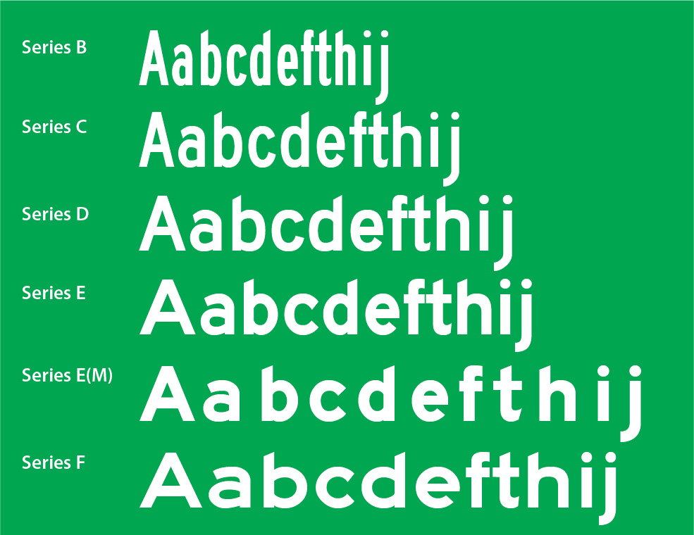
Series E-Modified, a mixed case typeface, has its roots in, the 1948 typeface developed by Ted Forbes, a highway engineer with Caltrans. Based on the mechanical quality of this typeface, it is assumed that Forbes used some type of lettering template and ruling pen to shape the initial lettering style that was then manipulated to accommodate retroreflective buttons. The weighty typeface has tiny interior shapes that is lost by overglow of letter stroke when used with modern high brightness materials; chamfered ascending letters and descending letters were added at a time and for reasons unknown.
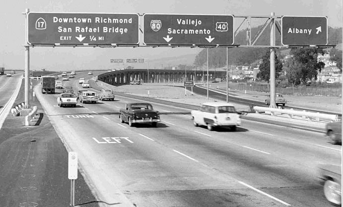
In 1956, Dwight D. Eisenhower signed the Federal Aid Highway Act establishing the Interstate Federal Highway System. With that, a new type of guide sign designed for high speed limited access roads displayed destination names in advance of exits, bifurcations or continuing directions. The Series E-Modified typeface for new signs was adopted from the 1948 typeface Ted Forbes developed for the divided highways in California. Though much questioned and criticized by optics engineers, retroreflective sheeting manufacturers and human factors scientists working to improve road safety for older drivers, Series E-Modified, arguably the “Rube Goldberg” font, remained the standard for over five decades.
In 2003 the FHWA added a series of lower-case letters to each of the five all upper-case fonts for use on street name and conventional road guide signs. These new fonts adopted the chamfered ascenders and descenders and constrained interior shapes of E-Modified. The fonts were intended for positive contrast applications only. Without scientific evaluation of readability and overall performance of the fonts, the new multi-weight series of typefaces was added to the MUTCD, the federal regulation for conventional road sign legends
Since the mid 1980s, the FHWA was aware that the older driver population, a growing percentage of the driving population, would require accommodation. Studies by FHWA confirmed the need but the solutions utilizing standard FHWA typefaces fell short. Enlarging signs to improve readability was a proposed solution limited by space and the engineering challenge of mounting big signs. Critically, an ineffective design remains so at any size.
Beginning in 1991, the Clearview design and research team focused on the needs of the older driver.
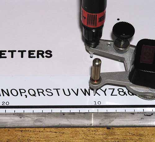
It appears that the forerunner to E-Modified was made with the simple tools available to an engineering draftsperson as there was nothing typographically common to E-Modified. T. Forbes created individual letters with a ruling pen and letter template and probably used a tool such as a Leroy lettering set (patented in 1935). The original letter was 1/2” letter height (upper case), the maximum size possible for this type of machine. The letters were then photographically enlarged and the stroke adjusted to a 1:5 stroke width to height ratio using drafting tools to make master cutting templates or dies to cut individual letters for manual assembly (10.6”, 13.33”, 16” and 20”).
Highway signs on California I-80 (1959)
Historical references provided by H. Gene Hawkins, Jr., Ph.D., P.E,. Texas A&M University, Professor, Zachry Department of Civil Engineering, Chair of the National Committee on Uniform Traffic Control Devices.