Engineered Standards: Create Performance Based Criteria for Sign Design
Background:
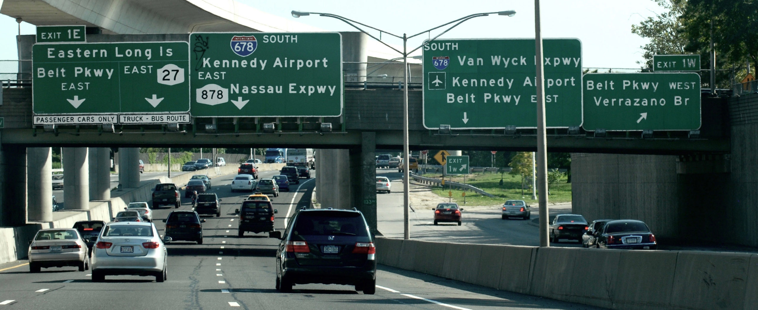
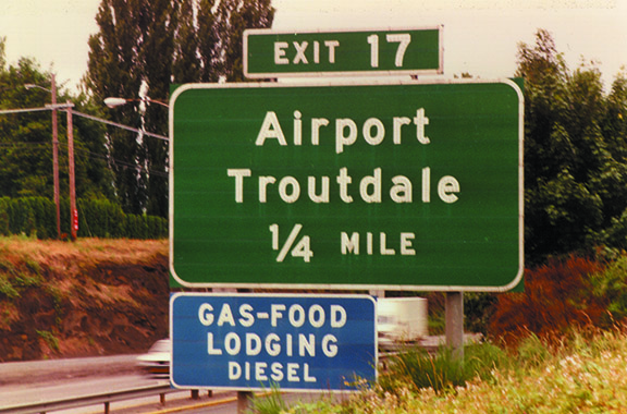
The development of Clearview began with an assumption that the use of typography in road guide signs could be improved, but the solution was neither obvious, nor conventional – and it took a long time.
Our work explored letterform designs with an emphasis on mixed case compared to all capital letters for conventional road guide signs and on mixed case for freeway guide signs with the goal of improving readability day and night. Successive designs guided by research, were more readable and legible from longer distances, day and night compared to existing highway fonts. Improvements yield more reaction time on the road with older drivers being the primary beneficiary, but all drivers benefiting.
For guide signs, we designed consistent sign layouts with uniform spaces surrounding words and all guide sign graphics (arrows, route shields, mileage, fractions, lane information, etc.) in an effort to improve glance readability and uniformity. We developed a proportion-based system with uniform figure-field layouts based on the initial capital letter height. The system uses clean mathematical proportions and in most all cases increases the size relationships of supporting graphic elements to the primary legend while expanding the space around objects, and without making the sign larger. With proportion-based layouts, the signs can be sized to posted speed and road configurations.
Based on our understanding of type design and guide sign formats, we suggest that typeface, type size and format could be applicable to regulatory and warning and other sign designs. This includes the frequent amalgamation of signs as posted in cities and on heavily used urban arterials. In cities and suburban arterials these sign types dominate the roadscape and are an important component of the Manual on Uniform Traffic Control Devices (MUTCD).
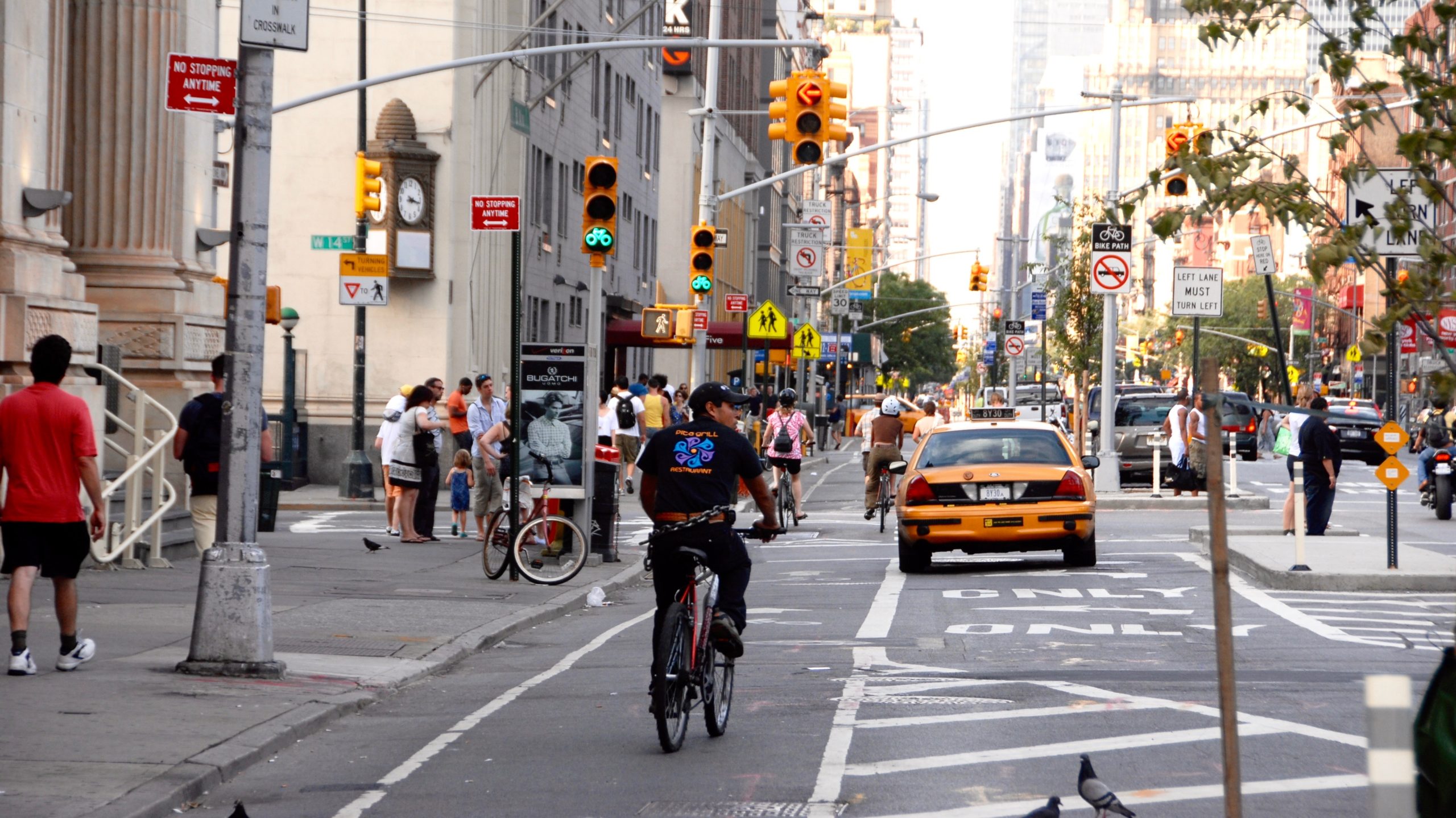
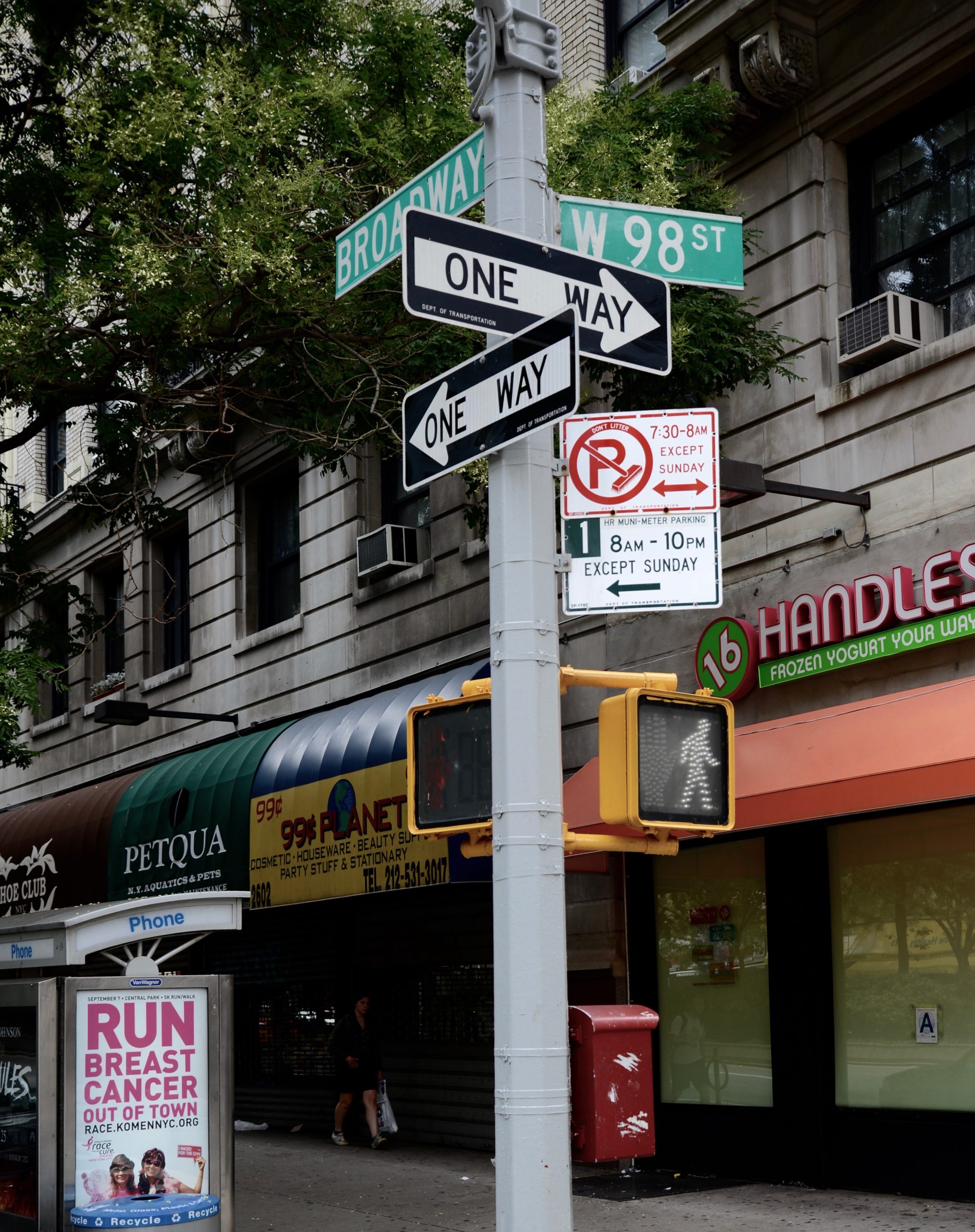
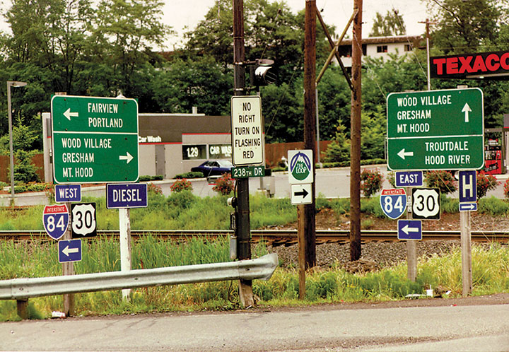
We studied how existing traffic control signs are used on roads, streets, high density urban and suburban corridors where signs are often displayed as assemblies of varied elements. In the analysis, we found common problems notably with signing at decision points on conventional roads and arterials.
Inventory of attributes of individual signs under the MUTCD
The team cataloged 613 signs in the 2003 and 2009 editions of the MUTCD. We documented all related specifications and attributes of each sign including; panel size, type size, font series, symbol and other characteristics.
Attributes of Sign Standards (613 Signs)
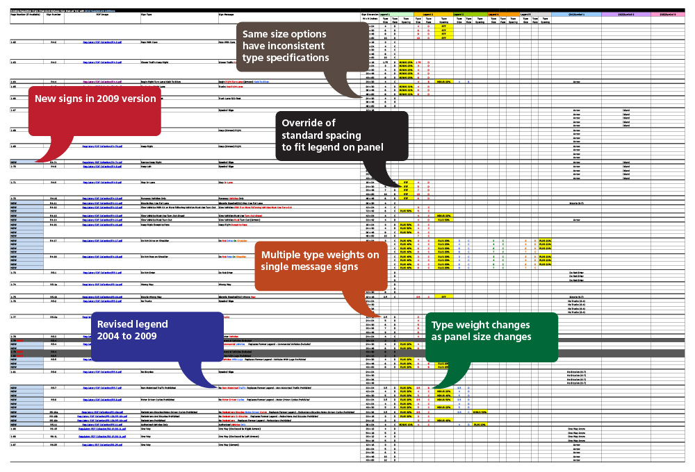
This analysis cataloged all signs in the MUTCD with hyperlink to actual signs (instant reference). The balloons identify specific attributes in this reference. The inconsistency in the manual is notable. Over a third of the signs cataloged broke from standard rules by either compressing word spacing, or using multiple font weights, or doing both in order to fit a legend on a panel.
Recommended approach to standards upgrade: Create visual grammar for sign design
Within the discipline of highway and street engineering and design, public signage is an outlier that has not been the subject of rigorous graphic and systems design and is dictated by history, not by design principles or human factors engineering.
Comprised of historical precedent, color and sizing to fit panels, the MUTCD standard is a loose collection of parts. Traffic signing would be improved if there were a clear set of rules for sign design.
Performance-based rules should be developed and applied to all aspects of surface transportation sign design. Sign displays based on a standard would give the motorists, cyclists and pedestrians information in a uniform, safe, visually efficient and unambiguous form. A design and research program to develop a performance-based grammar of highway sign design would include:
1) Performance characteristics of typeface
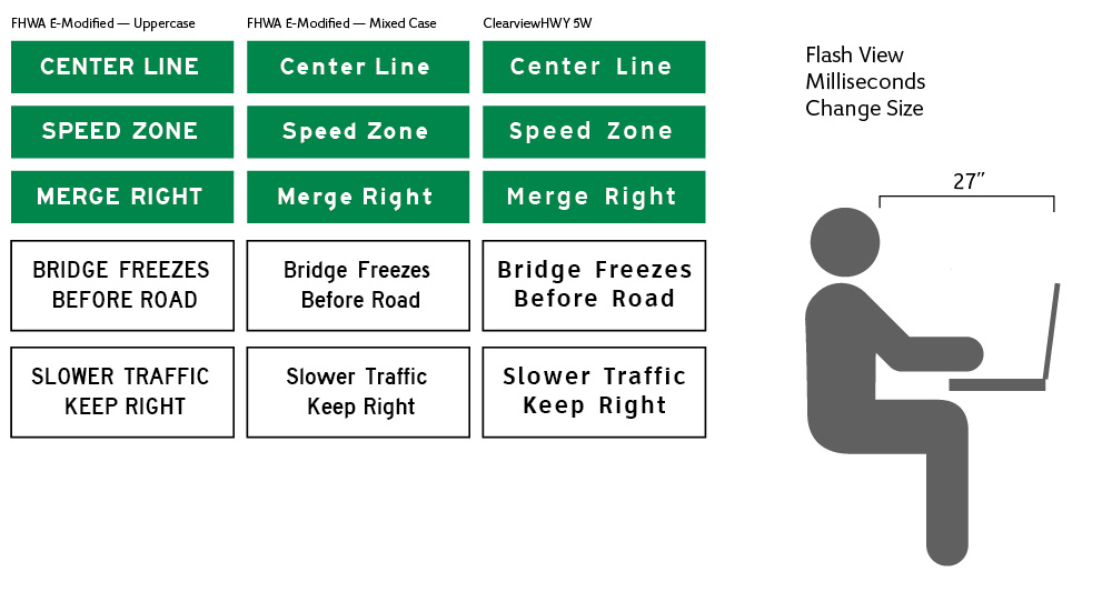
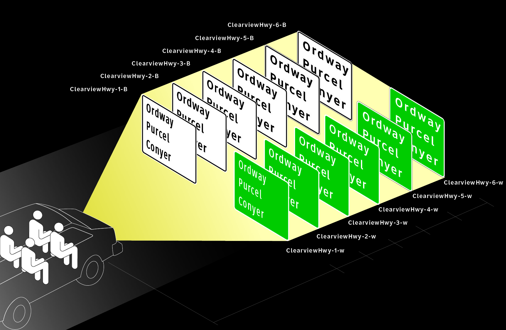
Quantify legibility and recognition for each weight of typeface in both positive and negative contrast applications. Compare existing FHWA standards (both all uppercase and mixed case) to Clearview in six weights and in positive and negative contrast versions with emphasis on negative contrast with standard spacing and reduced letter and word space. This includes single words, short phrases (two words) and longer instructive or regulatory phrases.
This data would allow signs used for a posted speed (street or road) to have common legend sizes. If mixed case legends were used for regulatory signs, the size would be determined by readability standards rather than by the size of panels; street name signs would be sized to prevailing speed. Parking control signs would be consistently designed for readability and understanding in a glance.
When the Interim Approval (IA-5) was granted to allow use of Clearview on guide signs, all research had focused on positive contrast applications. Analysis as proposed above for all weights of Clearview in negative contrast applications was requested by the FHWA Office of Safety when the Interim Approval (IA-5) was granted. Completed research (research study #3) showed how this can be a design tool. Proposed research can become a basis for design of traffic control devices.
With various methods to test recognition, readability and legibility, the research protocol and studies may be executed by university-based teams representing more than one institute. This may include laboratory and field research. The process would ideally corroborate findings given the importance of the research findings as a design tool for these safety critical applications.
Quantify Legibility (LI) and Recognition Distances for each weight of Clearview in Negative Contrast and Positive Contrast, Day and Night.
2) Visual Grammar for Sign Design
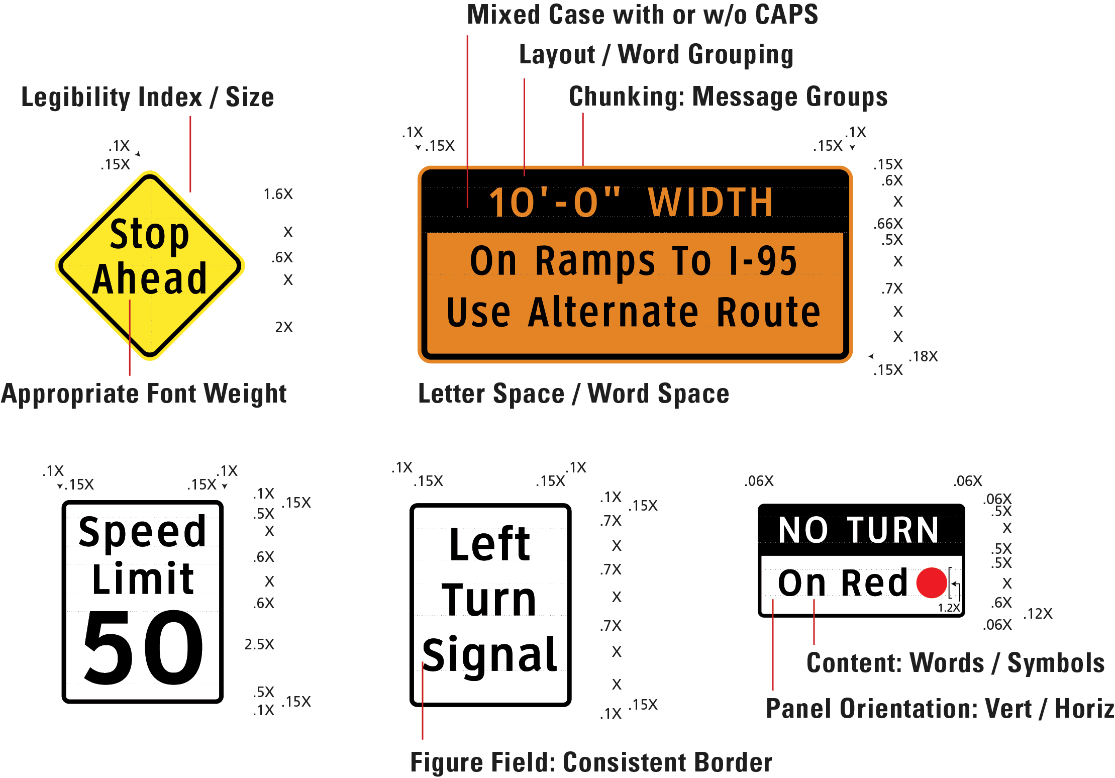
The design and research program will evaluate the performance of various types of signs using psycho-physical techniques and other types of comparative study. This research will study legibility, understanding of content based on controlled exposure times that replicate glance reading. Variables will augment layouts to test how graphic devices enhance readability and understanding. These include:
- legibility index / size by font weight
- layout / word grouping
- content: words and symbols
- figure/field: determine minimum and optimal effective area
- chunking: grouping massages for glance reading.
- panel orientation: vertical / horizontal
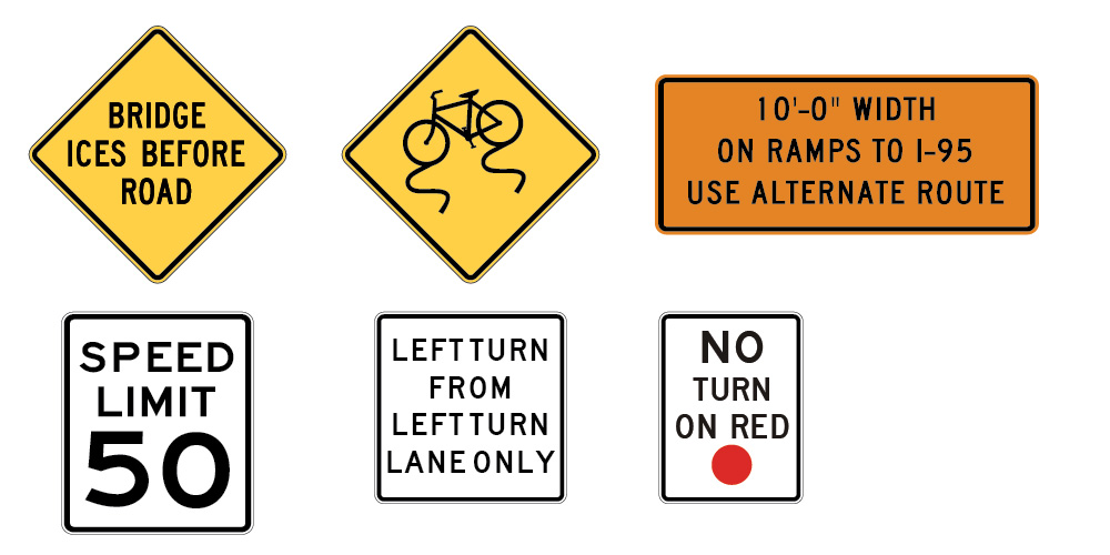
A Representative Sample of Existing Regulatory and Warning Sign Panels in the MUTCD
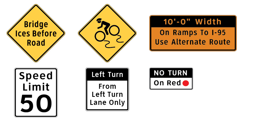
A Comparative Sample of Regulatory and Warning Sign Panels Using Mixed Case Clearview Legends and Various Layout Techniques
3) Identify site-specific applications
Based on accident data and observation by participating cities, specific applications or groups of sign types can be refined or redesigned. These designs will use the performance data for typeface and specific layout techniques to create and test site-specific signs.

In this illustration a right turn lane shifts to the right with bike lane crossing to the left. The suggested solution will be a site-specific application with unique target value to replace the current standard. In this crossover, the existing application is posted within the same city block that ends at the conflict area, leaving little time to respond. Accident data suggests that signing may be part of a solution to improve the safety of a crossover where advanced notice is displayed within a block to forewarn of a condition. This concept design, developed with the Portland, Oregon city traffic engineer, attempts to address the shared use condition with a conspicuous graphic that should enhance understanding and compliance.
Conclusion
It is envisioned that the results of the design and research process will identify performance criteria and enhanced designs for guide and traffic control devices. All roads, particularly urban and suburban roads and streets where traffic control devices and guide signs compete, should benefit from performance-based designs. This work could be completed with a team that includes traffic engineers, human factors research scientists, graphic designers with city traffic planners as advisors.
This proposed process should improve overall safety of motorists, cyclists, and pedestrians alike. A standard supporting greater harmonization, efficiencies in design and sign management would enhance uniformity to the Manual on Uniform Traffic Control Devices.
