1) Early Clearview font design & word pattern studies
Mixed case out-performs all upper case when word footprint area is harmonized in older driver study.
Preface: This section presents research on the first generation of the Clearview typeface. This included two weights as used on highway and freeway guide signs. Research on the font was conducted in four separate parts to compare word recognition and legibility to current standards in day and night viewing conditions. This older driver study included two types of reflective sheeting materials. Each study had 12 subjects, all over age 65, with valid Pennsylvania drivers’ licenses. Subjects were vision tested before participating.
The results of this group of studies ran from no change to significant change. The findings provided a very clear road map that would include four upgrades to the typeface design. These designs were studied in over a dozen peer reviewed and published studies.
The following summary pulls directly from the original research. It does not include statistical analysis and the performance comparison of encapsulated lens and micro-prismatic sheeting. This detail is available in the cited research.
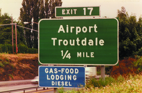
Goal The goal of this study was to identify ways to improve legibility and recognition of legends on conventional road guide signs, with consideration for night vision, high-brightness sign materials, and aging drivers, by replacing the 40-year-old guide sign font with a new font called Clearview. The rationale for the research was twofold. First, a widely accepted notion is that the thick stroke of the current high-way guide sign font, rendered in high-brightness materials, exhibits a phenomenon known as irradiation or halation (1). Irradiation becomes a problem if a stroke is so bright that it usually bleeds into the character’s open spaces, creating a blobbing effect that reduces character legibility. The Clearview font’s wider open spaces allow irradiation without decreasing the distance at which the alphabet is legible (Figure 1). Second, it was thought that there was a need to revisit the notion that the use of properly sized mixed-case legends, instead of all-capital displays, for destination names on conventional road guide signs would improve driver recognition of destination names through word patterning (2).
Font Development The Clearview font was developed by Meeker & Associates, Inc., a graphics design firm, and tested by the Pennsylvania Transportation Institute (PTI) at Pennsylvania State University.
For purposes of this research, the font was required to have some relationship to the two existing federal typefaces that were being compared [Standard Highway Series E(M) and Standard Highway Series D]. To that end, the new typeface was designed in regular and condensed version. These versions, subsequently named Clearview and Clearview Condensed, incorporate the desirable attributes of a group of typefaces studied by Meeker & Associates but retain the visual proportions of the existing FHWA typefaces. Initial versions of the fonts were improved and recreated numerous times. Formal comparisons of various early renditions of the fonts were made through subjective field evaluation, objective tests of the typefaces’ degradability, and objective laboratory studies that used computer simulation. These comparisons resulted in the 1st generation versions of Clearview and Clearview Condensed that were used in the two objective field evaluations of a new typeface design to aid the older driver.
Uppercase Versus Mixed Case Forbes et al. (2) conducted what are perhaps the definitive studies of the difference in legibility between text depicted in all uppercase letters and that depicted in lowercase with initial capital letters. When upper-and mixed-case words occupied the same sign area, Forbes and his colleagues found a significant improvement in reading distance with the mixed-case words. It must be understood, however, that these results were obtained with a recognition task. That is, the observers knew what words they were looking for. In instances in which the text is not known to the observer, improvements with mixed-case words are not evident (1,2). Although mixed-case superiority is fairly well accepted in the traffic engineering community [Markowitz et al. (4) provided specific information suggesting the use of mixed-case lettering for conventional road guide signs in 1968], conventional road guide signs still are being created with all uppercase letters.
Study 1: Effect of Font, Case, and Reflective Sheeting on Word Recognition
Objective and Methodology The objective of this study was to compare the recognition distances of words displayed in the mixed-case Clearview font with the Standard Highway Series D all-uppercase font and the mixed-case Standard Highway Series E(M) font, by using older vehicle operators under daytime and nighttime viewing conditions.
Variables The dependent variable was threshold distance for word recognition. The subjects were to find a target word on a sign containing three words. The operational definition of threshold was the furthest distance at which a subject could correctly identify the target word’s location on the sign: top, middle, or bottom. A word recognition task, as opposed to a pure legibility task, was used to better represent what the researchers believed to be true field performance. The premise was that most people know the name of the town or street for which they are looking and have a mental picture of the word when they attempt to read a guide sign.
PTI Nighttime Track Study (1995)
PTI Daytime Track Study (1995)
Because of the increased “openness” of the Clearview characters, the font’s intercharacter spacing is smaller than that of Standard Highway (Figure 2). Clearview spacing results in words that take up 12 percent less sign space than do the Standard Highway fonts. A 12 percent increase in Clearview character height produces words equal in sign space to those shown in the Standard Highway fonts. This study included Clearview fonts matched in letter height with Standard Highway and Clearview fonts matched in overall sign size with Standard Highway. The resulting fonts are called Clearview (or Clearview Condensed) at 100 percent (of Standard Highway letter height) and Clearview (or Clearview Condensed) at 112 percent (of Standard Highway letter height), respectively. Specifically, the fonts tested were Clearview Condensed at 100 percent (mixed case), Clearview Condensed at 112 percent (mixed case), Standard Highway Series E(M) (mixed case), Standard Highway Series D (all uppercase), Clearview at 100 percent (mixed case), and Clearview at 112 percent (mixed case).
The 1st generation Clearview Bold design has the same capital letter height as E-Modified. The area of the word is much smaller because the typeface does not require as much letterspace as E-modified. The Clearview Bold (112) has been enlarged to match the overall area required by the E-Modified.
The 1st generation design for Clearview Condensed (100) subtended a much smaller area compared to the all uppercase FHWA Series D. The display above illustrates the Clearview Condensed (112) with overall area enlarged to match the all upper-case series D. Both versions were compared in this research.
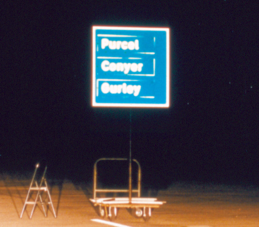
Six test words were used in this study: Purcel, Dorset, Conyer, Bergen, Ordway, and Gurley. Three word-selection criteria were used. The first was similarity of word length, used to avert word recognition based on word length only. The second was similarity of initial letter; that is, all words began with a rounded letter form. The third criterion was dissimilarity of global word shape or “footprint”; Purcel and Dorset have ascenders at the end, Conyer and Bergen have descenders in the middle, and Ordway and Gurley have ascenders in the middle and descenders at the end. Words with similar initial letters were selected to avoid word recognition based solely on initial letter recognition. Words with dissimilar footprints were selected to allow global word shape to affect word recognition distance.
Procedure Each subject was tested individually. A repeated-measures experimental design was used in which all subjects viewed all 12 experimental conditions (i.e., six fonts and two materials). The subject was located in the front passenger seat and an experimenter was in the driver’s seat. At night, low-beam headlamps were used. Each sign panel contained three place-names. Before each sign was presented, the experimenter read aloud a place-name for the subject to find. With the observation vehicle parked at 305 m, the sign was presented and the subject attempted to find the target word. The experimenter then drove the vehicle toward the sign at approximately 16 kph (10 mph) until the subject correctly stated the target word position: top, middle, or bottom. When the subject correctly located the target word, the experimenter stopped the vehicle and recorded the threshold distance. The car was turned around and driven back to the 305-m mark. The second sign was then displayed and the procedure was repeated. This procedure was in turn repeated until a threshold for each of the 12 signs was established.
Analyses and Results
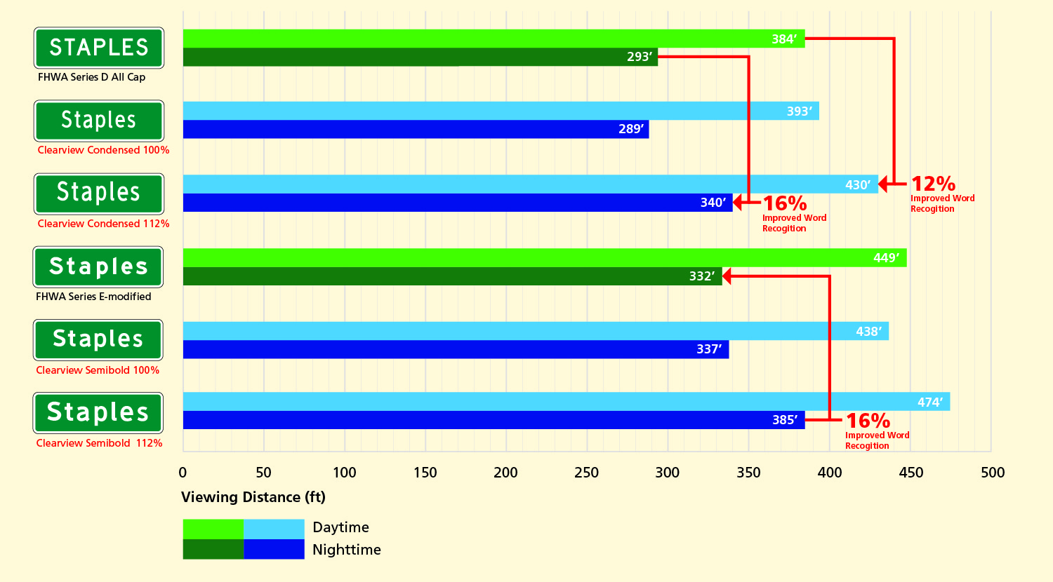
Word Recognition: Daytime Study — Highway Gothic Series E(m) & Series D vs. Clearview
Daytime There were no significant differences between either the Clearview or Clearview at 112 percent and the Series E(M) fonts. Comparisons between the Clearview and Clearview Condensed at 112 percent versus Series D, however, showed that the mixed-case fonts produced significantly longer recognition distances than the all-uppercase Standard Highway font.
Word Recognition: Nighttime Study — Highway Gothic Series E(m) & Series D vs. Clearview
Nighttime Clearview font at 100 percent did not result in a significant improvement over Series E(M), the Clearview font at 112 percent had significantly greater recognition distance than the E(M). The mixed-case Clearview and Clearview Condensed at 112 percent again significantly outperformed the all-uppercase Series D.
Discussion of Results The mixed-case Clearview characters outperformed the all-uppercase Series D by as much as 14 percent in daytime and 16 percent at night, as long as the mixed-case font subtended an equivalent sign area. If the mixed-case font took up less sign space, as with the Clearview Condensed at 100 percent, there was no difference between mixed-case and all-uppercase characters. During daytime testing there was no difference between Series E(M) and any comparably sized Clearview font (i.e., Clearview and Clearview at 112 percent). At night, however, with both high-brightness materials, the Clearview font at 112 percent outperformed the Series E(M) by 16 percent.
Word Recognition: 1st Generation Clearview Compared to FHWA Series D and E-modified (Mean for all participants)
Study 2: Effect of font and reflective sheeting on word legibility
Word recognition as the measure of effectiveness in the previous study was based on the premise that word recognition is the dominant mode of guide sign reading in the real world. There are two reasons, however, to supplement the recognition data with pure legibility data. First, there may be situations in which travelers do not know their intended destinations, or at least do not have a firm mental picture of the place-names. Second, a great deal of sign readability literature has used the legibility paradigm; therefore, a direct comparison of the current research with the bulk of the literature would not be possible without a legibility component.
Objective The objective of this study was to compare the legibility distances of words displayed in the mixed-case Clearview font with the Standard Highway Series D all-uppercase font and the mixed-case Standard Highway Series E(M) font, by using a sample of older vehicle operators under daytime and nighttime viewing conditions.
Methodology
Site and Apparatus The test site, signs, word panels, and test vehicle were identical to those described in the previous study, except that the signs in this study were shown with a single word placed in the middle position on the sign.
Procedure The procedure was the same as for the previous study except that the subjects were required to read a single word mounted in the middle of the sign. The subjects were not told what word would be on the sign. When the subject read the word correctly, the experimenter stopped the vehicle and read and recorded the threshold distance.
Analyses and Results
Word Legibility: Daytime Study — Highway Gothic Series E(m) & Series D vs. Clearview
Daytime As in the previous daytime study, there were no significant differences in daytime legibility between Series E(M) and comparably sized Clearview fonts (Clearview and Clearview at 112 percent). Unlike in the previous study, however, there also were no differences between the all-uppercase Series D font and comparably sized mixed-case Clearview fonts (Clearview and Clearview Condensed at 112 per-cent). The all-uppercase Series D significantly outperformed the Clearview Condensed font at 100 percent.
Word Legibility: Nighttime Study — Highway Gothic Series E(m) & Series D vs. Clearview
Nighttime One finding was that the Clearview font at 112 percent significantly outperformed the Series E(M) font by 22 percent. As in the daytime portion of this study, there were no differences between the all-uppercase Series D font and comparably sized mixed-case Clearview fonts (Clearview and Clearview Condensed at 112 percent). The all-uppercase Series D significantly outperformed the Clearview Condensed font at 100 percent under nighttime conditions.
Discussion of Results
A dramatic overall lowering of legibility index (LI) was found in the legibility study compared with the recognition study. LIs of about 9 m/cm (75 ft/in.) of letter height found with the recognition task fell to about 4.8 m/cm (40 ft/in.) in the legibility study. The subjects were almost twice as successful in recognizing expected words than in reading unknown words.
Although only the encapsulated lens sheeting showed statistically significant font results (22 percent), the microprismatic sheeting showed the same trend, with Clearview resulting in 11 percent longer legibility distance than Series E(M).
The lack of significant results in the mixed-case versus all-uppercase analyses in the legibility study was expected. The results are consistent with earlier work by Forbes et al. (2), who also found significant improvements with mixed case in a recognition task but not in a legibility task. Furthermore, given the size difference between Series D and Clearview Condensed at 100 percent it again would be expected that Series D would be superior with a pure legibility task because this task is tantamount to a large-scale acuity test.
Conclusions
Mixed Case Versus All Uppercase In the legibility task, in which individual letter reading is required, the larger letters used with the all-uppercase Series D font resulted in greater legibility distances than did the smaller mixed-case Clearview Condensed font; however, when the mixed-case font was increased in size to take up the same sign area as the Series D font, performance between the mixed-case and all-uppercase words was the same.
In the recognition task, the two mixed-case fonts that matched Series D in sign area performed significantly better than all-uppercase font. Even the version of Clearview Condensed that took up much less sign space performed as well as the Series D all-uppercase font. There are two likely reasons for the mixed case superiority in the recognition task. First, when viewed from far away, all-uppercase characters look like fuzzy rectangles whereas words in mixed case, with ascenders and descenders, have a distinct shape or footprint. Second, mental images of place-names (indeed, of all proper nouns) are likely to be in mixed case, making it an easier cognitive task to make a match with mixed-case sign copy than with words depicted in all-uppercase letters.
Guide signs probably are read by using both legibility and recognition criteria, depending on the specific needs of the traveler. The studies reported here indicate that if the size of mixed-case words is matched to the size of words depicted in all-uppercase letters (a cost-effectiveness measure), mixed case provides equivalent reading distance in a legibility task and superior reading distance in a recognition task. It is, therefore, the conclusion of this report that mixed-case words should be recommended for use not just on high-way guide signs but on all guide signs, including conventional road and street name signs.
Clearview Versus Series E(M) Under daytime conditions, there was no difference in either word legibility or recognition distance between the Series E(M) and either of the two comparably sized Clearview fonts. At night, however, with brightness sign materials, the Clearview font produced substantially longer reading distances. In both the legibility and the recognition tasks, the Clearview fonts that took up the same amount of sign space as did the Series E(M) resulted in significantly longer nighttime reading distances, and the version of Clearview that took up less sign space than did Series E(M) performed as well as the Series E(M).
Mace, D. M., P. M. Garvey, and R. F. Heckard. Relative Visibility of Increased Legend Size Vs. Brighter Materials for Traffic Signs. Report FHWA-RD-94-035. FHWA, U.S. Department of Transportation, 1994.
Forbes, T. W., K. Moscowitz, and G. Morgan. A Comparison of Lower Case and Capital Letters for Highway Signs. Proc., 30th Annual Meeting of the Highway Research Board, Washington, D.C., 1950.
Garvey, P. M., M. T. Pietrucha, and D. T. Meeker. Development and Testing of a New Guide Sign Alphabet. Pennsylvania Transportation Institute Final Report PTI-9627. Pennsylvania State University, University Park, 1996.
Markowitz, J., C. W. Dietrich, W. J. Lees, and M. Farman. An Investigation of the Design and Performance of Traffic Control Devices. Report 1726. Bureau of Public Roads, U.S. Department of Transportation, 1968.
Standard Alphabets for Highway Signs: A Reference Guide for the Standardization of Letters and Numerals Used on Highway Signs Specified in the Manual on Uniform Traffic Control Devices. FHWA, U.S. Department of Transportation, 1989.