The Anatomy of the Clearview Typeface
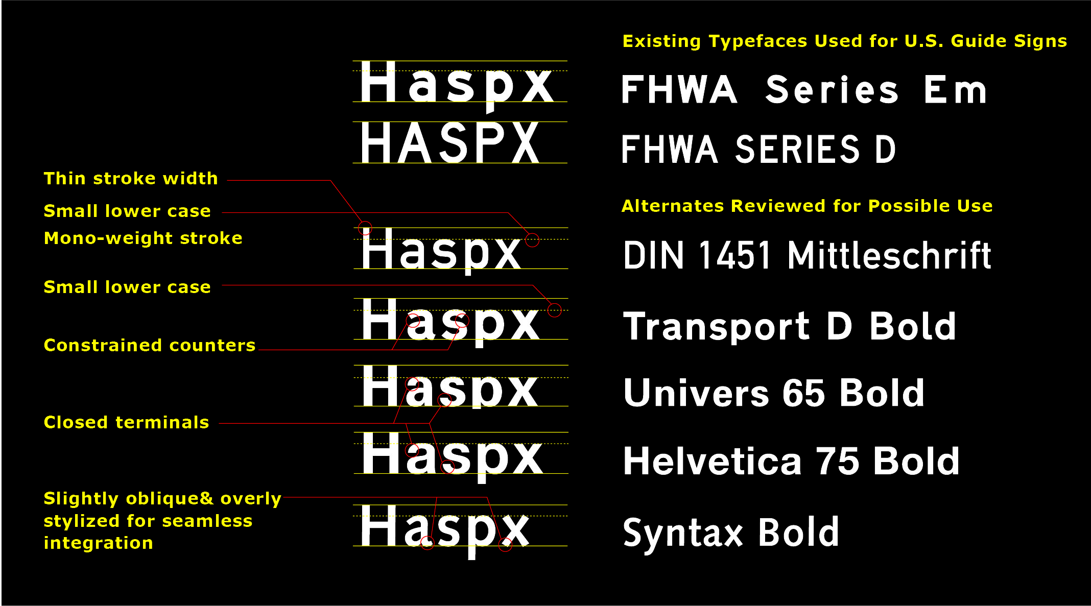
As they embarked on work to improve effectiveness of road signs, the project designers and human factors researchers conducted observations of the existing FHWA Standard Alphabets, and other commonly used san serif fonts that includes: British Transport, DIN Standard Series, Frutiger, Univers, Syntax and Helvetica. These typefaces are used in highway signs, safety signs on waterways and for airport wayfinding programs. Dozens of signs with uppercase and mixed-case sans-serif typefaces in various weights were compared in parking lots and on the platform railing of a local commuter rail station – our first labs. These observations informed our initial understanding of viewing legends from long distances.
Preliminary Analysis with Project Team
The team observed that no existing typefaces for highway signs for wayfinding in airports or similar public places offered the attributes that would result in improved legibility needed to accommodate the older driver or that would be applicable to a system of applications. The initial design process to develop two weights for guide signs began.
Our technical team consisted of traffic engineers, human factors research scientists, graphic designers, sign systems designers and a digital type designer.
FHWA E-Modified freeway font (mixed case) and FHWA Series D font (upper case) were compared to the new mixed case alphabet in early trials initially funded by the 3M Company.
The project employed both laboratory and test track research. Research studies were peer reviewed, presented and published. Based on the positive results of these initial studies, state departments of transportation funded continuing phases of the research. FHWA Traffic Operations staff were periodically briefed in field demonstration workshops at the Maryland State Highway Administration maintenance facilities, and at the Pennsylvania State University vehicle test track.
Evolution of a Design
Hand drawn designs allowed us to understand key elements of each letter and their impact on the overall design. Although the 1:5 stroke width was maintained, the design placed the letterforms on a diet that the visual structure of E-Modified would not accommodate.

Creating a Precision TrueType Font
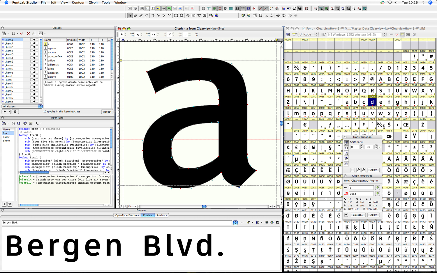
Once early designs were drawn by hand, the letters were scanned, traced and the designs refined as TrueType letterforms to meet industry standards and insure uniform use of type data across all software applications for engineering, design, and manufacturing. Ikarus and Font Lab software assured harmonization and consistent letter space metrics. The resulting digital fonts are similar to those used in word processing but with metrics we developed for road sign design and production.
There were five upgrades in the typeface design based on research studies conducted by The Texas A&M University Transportation Institute, The Larson Transportation Institute at the Pennsylvania State University and by extensive day and night observations by the design and research team.
Optimizing Letter Spacing
As the designs were refined, letter combinations were assembled within the software with a cascade of letter space. These were printed at full-scale and compared with randomly mixed variations. We knew that letters appear closer together when viewed at long distances. To accommodate this phenomenon, spacing was opened. Striking a balance for each of the six weights and for both negative and positive contrast versions of Clearview required different dimensions of openness for each font weight.
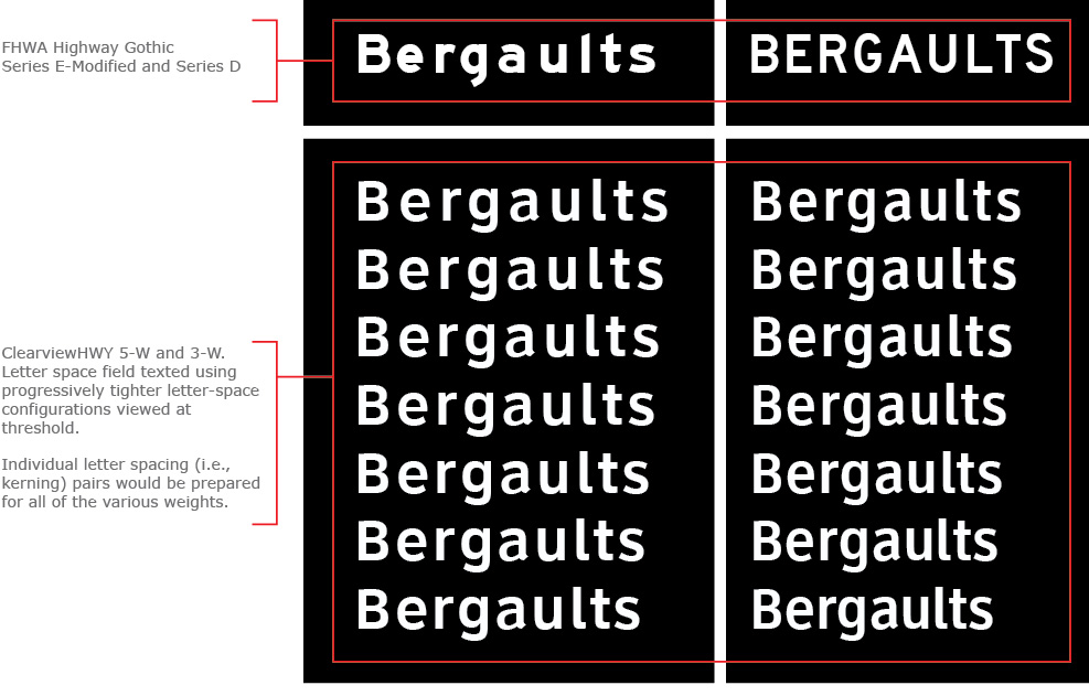
Clearview 5-W: Typeface for Freeway Guide Sign Applications
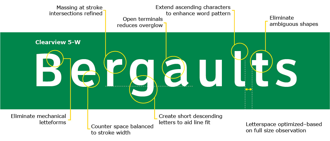
The illustration below compares FHWA Series E-Modified (top) to Clearview 5-W (bottom) with the attributes of the design noted. Both examples are shown with default letterspacing. The vertical stroke width is common to both typefaces (1:5). In this design, the shape of four lower case letters (“a, e and s) and a letter with both bowl and vertical stroke (e.g. “p, d or b”) set the visual architecture for the overall font design. Every aspect of the design emphasized function when viewed in both negative and positive contrast applications.
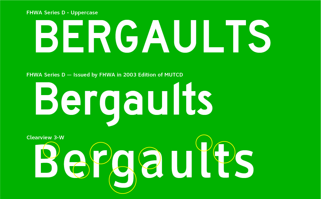
Clearview 3-W: A Mixed Case Typeface for Conventional Road Guide Sign Applications
This Illustration compares the FHWA Series D, all uppercase typeface (top) used for conventional road guide signs and regulatory signs. In 2003 the FHWA introduced a companion lowercase font (middle) for this and all other FHWA typeface series (middle). The Clearview 3-W font design (bottom) shown in the lower section of the panel. Research shows that the Clearview 3-W is more readable and legible by 29 percent daytime and 22 percent at night compared to FHWA Series D in mixed case.
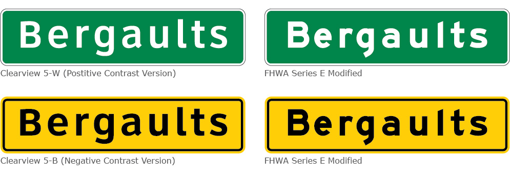
Negative and Positive Contrast Versions of Typeface, with each Optimized for High Brightness Retroreflective Materials
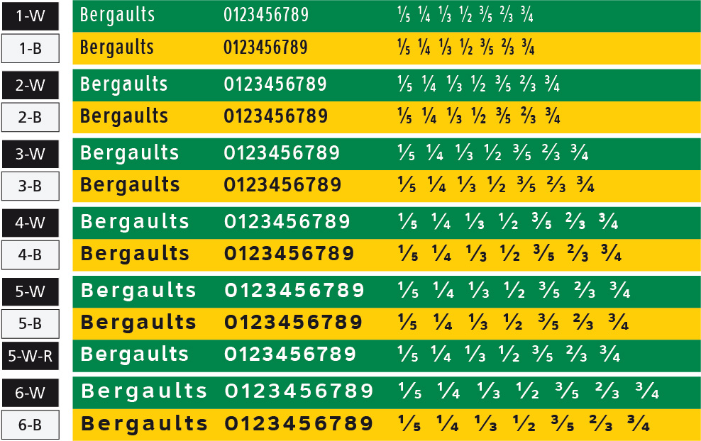
The final design includes both a negative contrast series and a positive contrast series of the 6 weights of the Clearview Type System. The negative contrast version (Clearview-B series) is slightly heavier. This compensates for the brightness of the surrounding area (yellow or white) which in high contrast can overglow into the black legend, especially when viewed by the older driver. With the positive contrast version (Clearview-W series), the opposite occurs. The white retroreflective letters glow outward. Therefore, the positive contrast letterforms retained a slightly thinner stroke-width. When viewed at a distance, positive contrast and negative contrast displays appear to have the same stroke width (Illustration: below left).
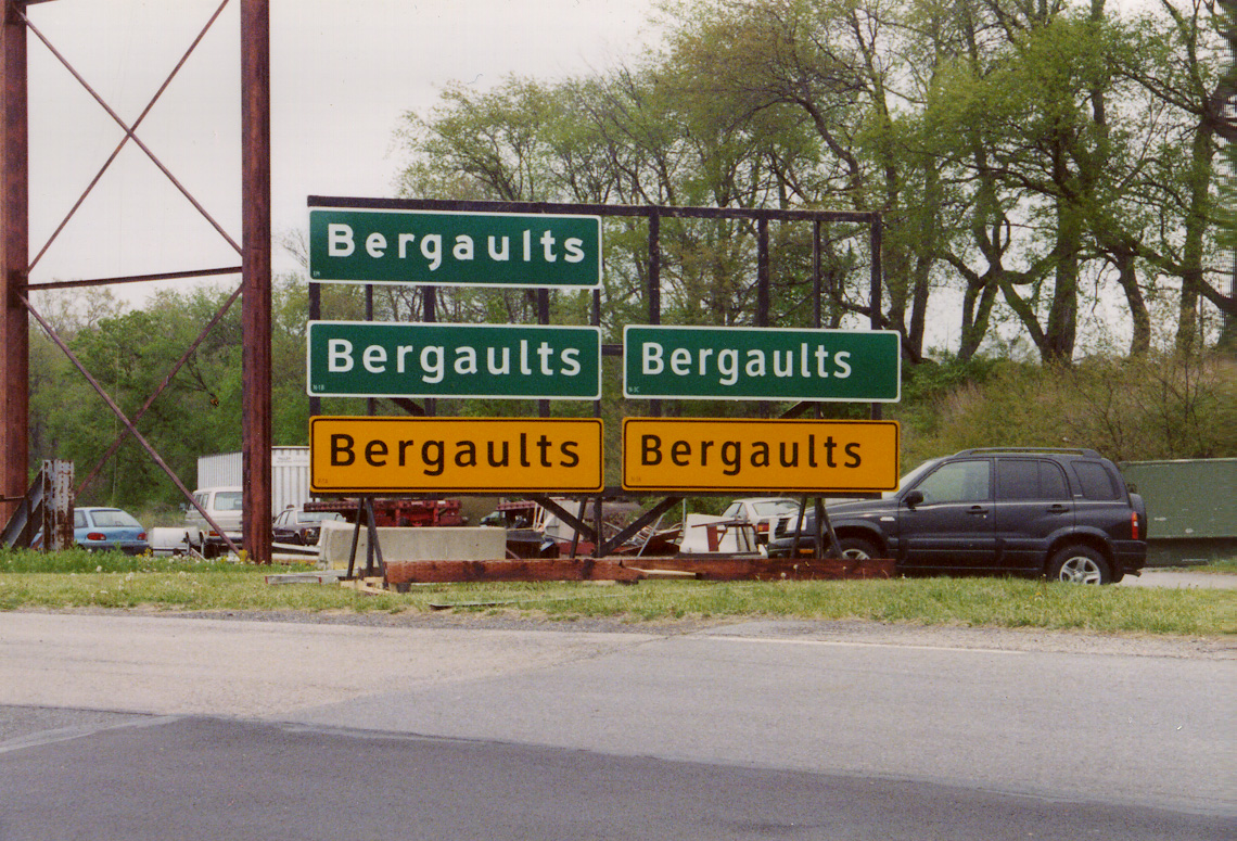
Final Demonstration for FHWA and Project Partners
The final design of Clearview was presented in the Spring of 2002 at the test track of The T.D. Larson Transportation Institute at the Pennsylvania State University. Observers included representatives from Texas Department of Transportation, Dallas – Fort Worth Airport Authority, Pennsylvania Department of Transportation and the Federal Highway Administration. A fully designed system of six complete typefaces with a version for positive contrast and negative contrast applications for each weight and existing FHWA standards were displayed for long distance view.
Participants walked backward on the track and realized that they could read the Clearview designs at distances as much as 40 percent greater than the distance at which they could read Highway Gothic E-Modified (passive viewing at 50 feet per 1 inch of capital letter height). The results of the demonstration of the final design surpassed those of earlier demonstrations.
In September 2004, based on requests from both the Pennsylvania Department of Transportation and the Texas Department of Transportation, Clearview received Interim Approval (IA-5) for positive contrast use on guide signs. Because the research focused on positive contrast guide sign applications, the FHWA stipulated that full approval would require comparative research on negative contrast versions of the Clearview Type System.
Clearview Typeface System
Clearview became a typeface system with six weights, each having versions for negative contrast applications and for positive contrast applications (12 in all). The system includes Clearview 5-W-R that differs from Clearview 5-W in that it has slightly less inter letter spacing. The inter letter spacing of Clearview 5-W-R assures that the width of long destination names for Clearview displays are comparable to that required for FHWA Series E-modified displays (see Research Study 2). Numbers and fractions have also been designed for legibility.
