Signing for Cycling
Cycling for recreation and basic transportation has increased exponentially. Over the last quarter century bicycle lanes, both dedicated and painted have been implemented in most medium and large cities and in suburbs nationwide; the U.S. Bike Route System has been implemented on 13,500 miles throughout the country; and there are now over twenty-two thousand miles of rail-trails across America. Cycling is now an integral part of the American surface transportation network.
Meanwhile, the streets and roads of America were designed for motorists. The cyclist is the visitor and rides with few safety protections. In 1978 signing for cycling was added to the MUTCD (Chapter 9). The added signs were adaptations of commonly used traffic signs augmented with an inanimate symbol of a bike. This visually inconsistent layer signage for cycling is now posted across the country. These sign regulations were adopted without research. The effectiveness – for cyclist or motorist – is questionable.
Concerned for safety, more urban clutter and what we envisioned as an added layer of information that was not very effective, we started Signing for Cycling, to address the lack of visual consistency in the FHWA sign standards. This system of signs was developed based on a nationwide survey of cities and interviews with urban highway engineers, cycling advocates and transportation planners. As cyclists, ourselves, we created a more cohesive standard to differentiate signing for cyclists from signing for motorists in shared use environments.
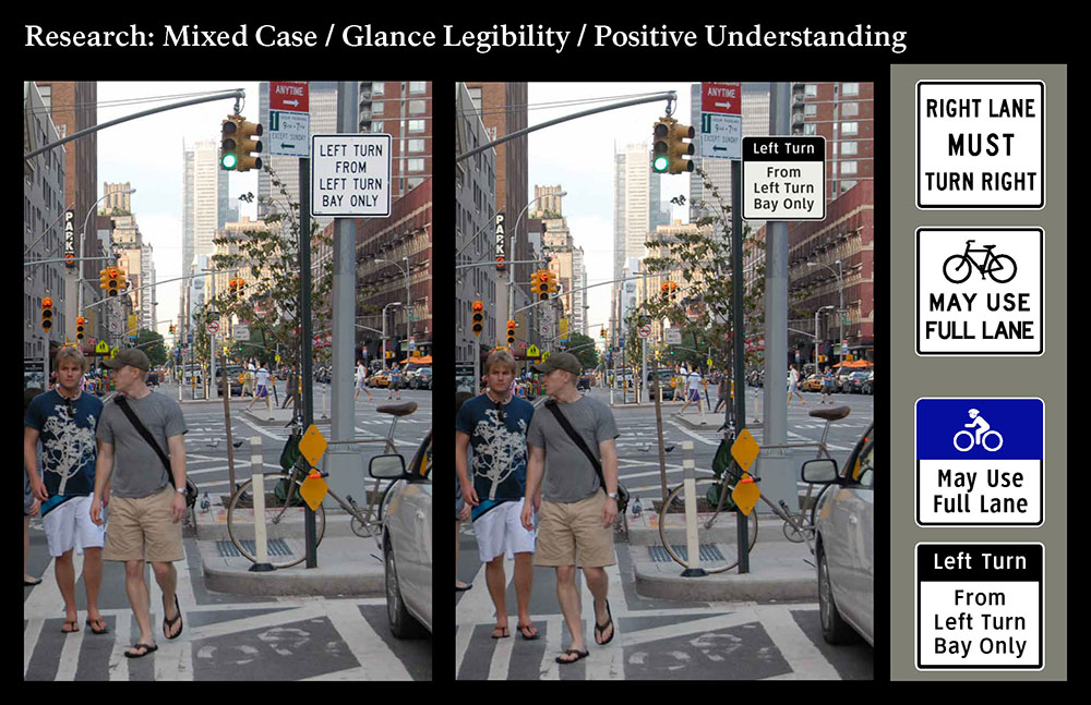
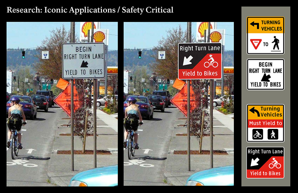
An advisory committee of traffic engineers and planners familiar with overall requirements for safe and effective facilities was consulted. Functions were harmonized based on content, overall size, and legend size (including use of mixed case). The project advisory team suggested an animate symbol be designed (with helmeted rider). Human factors research scientists at Virginia Tech found the animate symbol, compared to the existing symbol to improve show understanding and legibility by. It was shown to be a significant improvement by all measures as a stand-alone symbol and in applications.
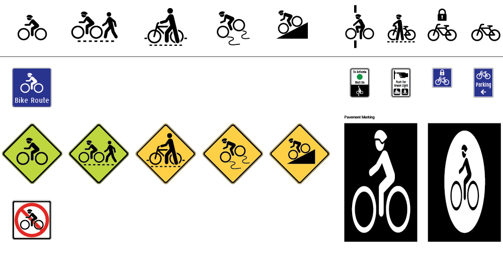
Existing inanimate bike (1978) and proposed animate cyclist symbol design for recommended system (2010)

Animate cyclist symbol design for regulatory, warning, lane management and guidance
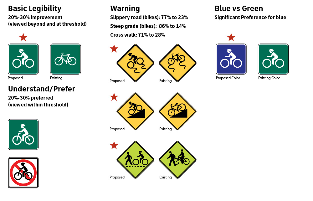
Research study addressed legibility improvement, enhanced understanding in warning, preference for blue color
Research by: Tonya Smith Jackson, Ph.D., the Grado Department of Industrial and Systems Engineering, Assessment and Cognitive Ergonomics Laboratory, Virginia Polytechnic Institute and State University.
Symbols identified with star out-performed existing standards. The color blue was preferred when compared to symbols with green background.
A representative group of cycling signs from the MUTCD, Chapter 9 (1978)

A Systematic Approach to Signing for Cycling
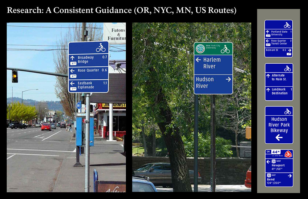
To identify how signing for cycling can be designed as a lineal system with greater visual continuity, we studied existing conditions in Portland (OR), Minneapolis/St Paul, New York City, other cities, state bike routes, rail trails, etc.
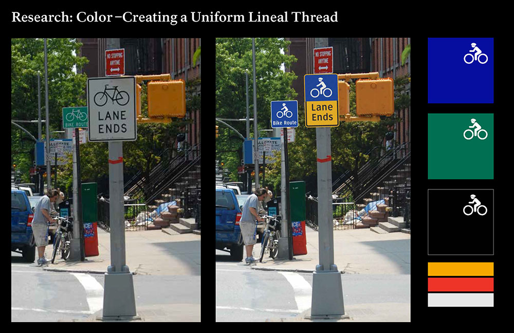
In this set of designs, six functional sign types were created and applications were harmonized by type size and panel size to provide visual continuity based on format, type size and panel size. Sign functions were added based on current needs offered by city transportation engineers. Blue (in lieu of green and or white) used in all cycling signage applications supports a visual identity. Although the blue color is assigned to hospitals, motorist services and the disabled, the content and the way the signs are used distinguishes cycling signage.
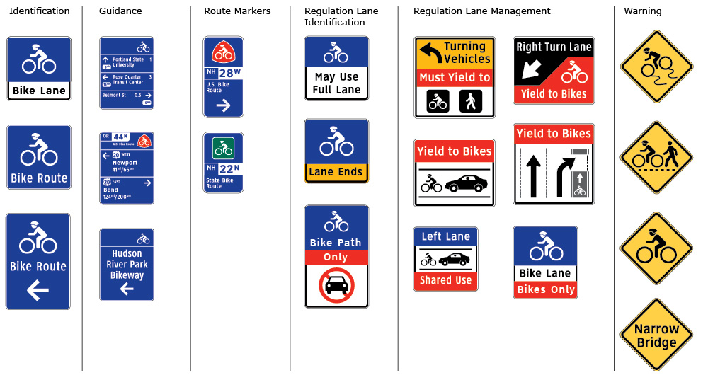
The plan attempts to stay within the visual vernacular of the MUTCD with some key changes that are proposed for validation by independent research studies. Once research is completed to measure the effectiveness of the systems approach, the overall program design will be evaluated by traffic engineers and cycling coordinators.
Conceptual Design Simulation
Although this set of recommendations breaks from FHWA rules for panel color and the use of mixed-case Clearview typeface for legends, the designs become a demonstration of a systematic approach to signage where cyclists and motorists share streets and roads. These five before and after simulations show how refinements help to differentiate signing for cycling and signing for motorists.
