
Support, Collaboration and Recognition
In a world where design is integral to communication systems, traffic control devices remained an untouchable outlier as comments about road sign clutter and inconsistency brought on a roll of the eyes and the comment, “It is what it is.”
We started the Clearview project with a goal of enhancing readability of traffic signs. We had no idea that it would gain more than academic attention, or that our work could save lives. On the other hand, our training in type design, systems design and human factors engineering guided us to try to understand why the standard is inadequate and how things could improve. And so, the project began.
TD Larson Transportation Institute (LTI) took on the first study and partnered in this project. The 3M Company provided a significant research grant to design two typefaces and study their effectiveness for older drivers, day and night and cast 3M research scientists in an advisory role.
Texas Department of Transportation and the Texas A&M Transportation Institute sponsored five studies on performance of Clearview compared to FHWA and UK standards.
The Pennsylvania Department of Transportation was the first state to prototype Clearview on state highways. Arthur Breneman, P.E. (ret.), Chief, Traffic Engineering & Operations for PennDOT (2002) said: “The design and development of Clearview was the most important advancement in road signing in 30 years.”
The FHWA recognized the importance of the final Clearview design as reviewed in 2002 on the LTI test track at the Pennsylvania State University. The Pennsylvania Department of Transportation made application to FHWA for approval to use Clearview on freeways and conventional road guide signs. FHWA gave Interim Approval for guide signs (positive contrast applications) in 2004.
Thirty states applied to FHWA for use; eighteen of those would commit to statewide implementation programs to upgrade guide signs. Of those 18, all recognized the improvement from the first viewing of l installations. The next fourteen years, state DOTs installed tens of thousands of signs that could be read more easily from a greater distance thereby giving drivers more precious reaction time.
In 2014 the FHWA recommended use of Clearview in their: Handbook for Designing Roadways for the Aging Population.
Charles A. Kilpatrick, P.E., Commissioner of Highways, Virginia Department of Transportation, responding to the FHWA request for public comment, wrote:
“VDOT’s experience with Clearview font has been very positive; there have been no documented legibility or driver confusion issues resulting from VDOT’s widespread Clearview conversion. Clearview font has been well received by our customers, who appreciate Clearview’s legibility, aesthetics, and lack of nighttime halation (over glow).
While the multiple sign font research efforts of the last 20 years have not always reached identical conclusions, they all support the conclusion that Clearview is, at a minimum, no worse than Standard Highway Font with regards to driver legibility. This research also concluded that Clearview font offers superior legibility for older drivers when properly used. In VDOT’s experience, the expense for the Department and its consultants to purchase the requisite licenses was negligible and well worth the resultant benefits.”
In Michigan, Clearview was introduced as one part of a state-wide strategy to accommodate seniors. In a study of that program (see research project 4 in the research review of this web site) Clearview was found to significantly reduce accidents, reduce the severity of crashes and significantly reduce fatalities and paid for itself in money that would be saved on emergency services, road repair post-accident, human cost, etc. Before the Michigan study we knew the numbers were good; we did not know how good.
Awards
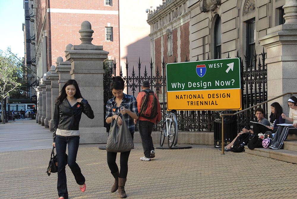
Clearview has been recognized for design excellence by the American Institute of Graphic Arts (AIGA) and the Society for Experiential Graphic Design (SEGD) gave Clearview highest honors. The design of Clearview has been featured by design periodicals in the U.S. and Europe. The New York Times, Car and Driver, American Scientist and National Public Radio among others presented Clearview to other audiences. In 2010, the Clearview design was recognized as one of 154 designs from around the world and included in the Cooper Hewitt Museum National Museum of Design Triennial Exhibition showcasing design that provided significant contribution to public health, safety and well-being. Clearview is in the permanent design collection of the Smithsonian Institution.
Clearview in the Public Press
Selected articles on his work have appeared in national design publications and in the general press including:
- The Mother Tongue of Our Vehicular Lives, Daniel Pund, Car and Driver Magazine, August 2019
- Sign Language, Monocle Magazine, May 18, 2017
- When Typography is a Matter of Life or Death, Lena Groeger, ProPublica, May 12, 2016
- Requiem for a Typeface, Henry Petroski, The New York Times (Editorial Page), February 25, 2016
- A Second Chance for an Old Road–Sign Font, Kriston Capps, CityLab – The Atlantic, January 27, 2016
- Clarity, Katia Bachko, The New Yorker, June 24, 2013
- Design for the Real World, Kurt Andersen, Studio 360, National Public Radio, October 17, 2008
- The Road to Clarity, Joshua Yaffa, The New York Times Magazine, August 12, 2007
- Signs Shape Up, American Scientist, September-October 2006
- Road Signs of the Times, The New York Times, December 21, 2005
- Safer Roads for Seniors, The Wall Street Journal, September 1, 2005
- Adopt a Font, I.D. (International Design), March-April 2005
- New Sign Language, Wired Magazine, March 2005
- Clearly Better, Creative Review (United Kingdom), January 2005
- Welcome Interstate Managers, Print Magazine, March-April 2004
- Finding 429 Million Visitors a Year, SEGDdesign, January 2004
- Evolution of a Typeface Design, SEGDdesign, February 2003
- Signs of the Times, I.D. (International Design), February 1999
- Clearer Signs Ahead, Ergonomics in Design, July 1998
- Specialty of Making Sense of Signs, The New York Times, March 19, 1998
- Designers Clarify Highway Hieroglyphics, The Wall Street Journal, December 1, 1995
- The Ins and Outs of Symbol Design, How Magazine, August 1998
- Signs to Make Clear Opportunities for Fun, The Wall Street Journal, January 8, 1992
History of Highway Sign Lettering
The Anatomy of the Clearview Typeface
Bibliography of research studies
Selected research and design that influenced this project
Engineered Standards: Create Performance Based Criteria for Sign Design